

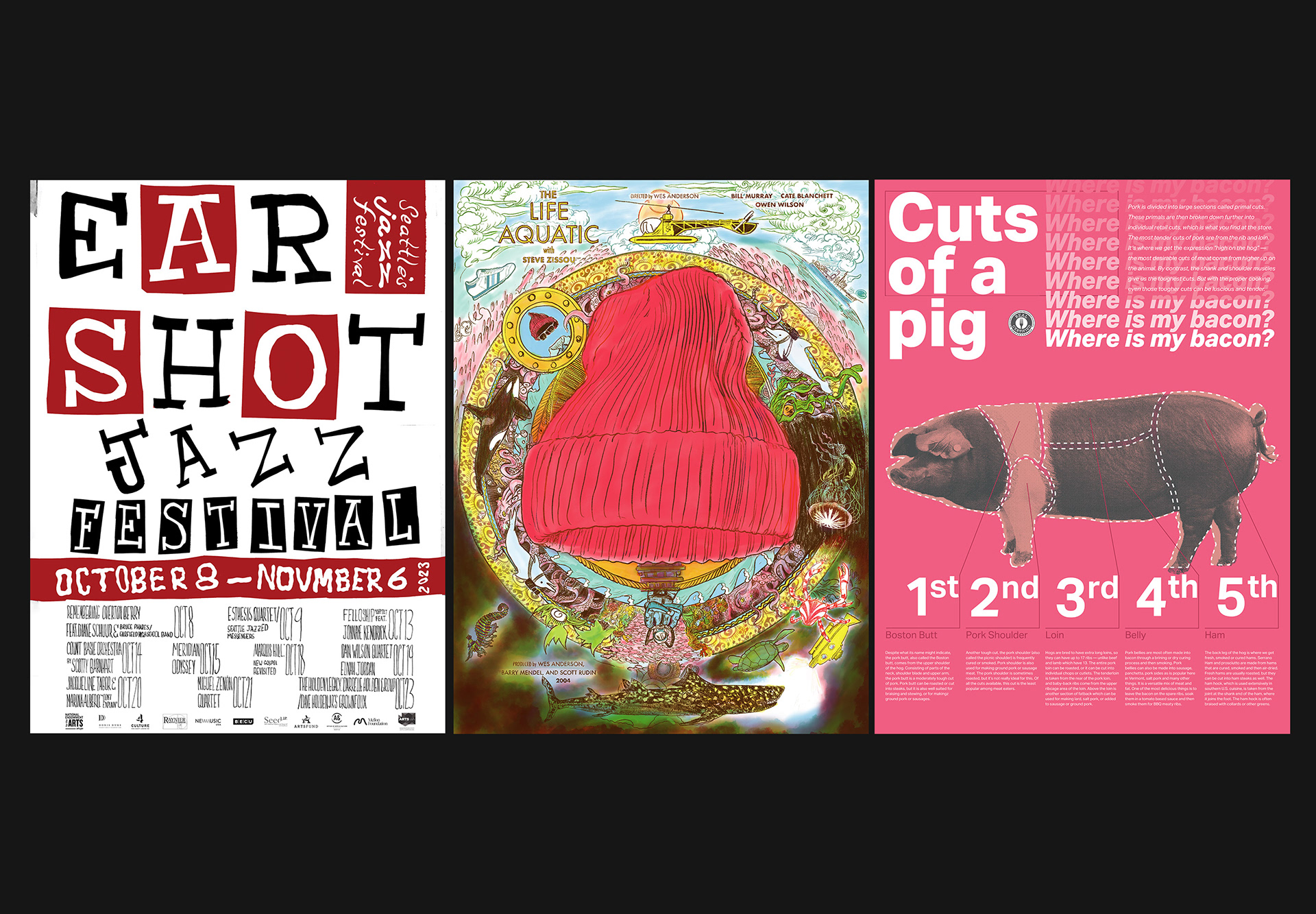
Project Category: Poster Design
Timeframe: Created between 2021 and 2023
Roles: Art Director, Visual Designer, Illustrator
Tools: Procreate, Photoshop, Indesign
Overview: The three posters in this suite were each created in order to practice a different style, design tool, or concept while keeping the viewer in mind by following the 2/2/2 rule (catch the viewer's attention in two seconds, holds the viewer’s attention for two minutes, and makes the viewer want to steal the poster and hang it on their wall for two years).
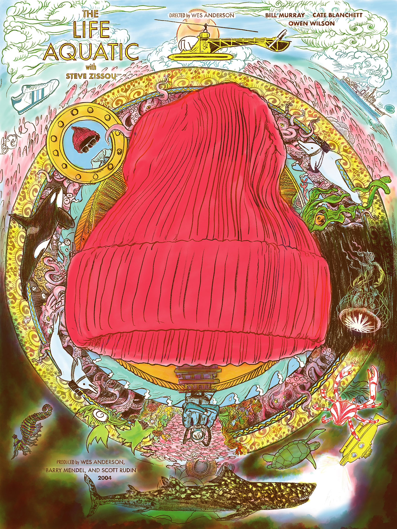
A Life Aquatic alternative movie poster, 2023,18"x24", 4 color, created using Procreate
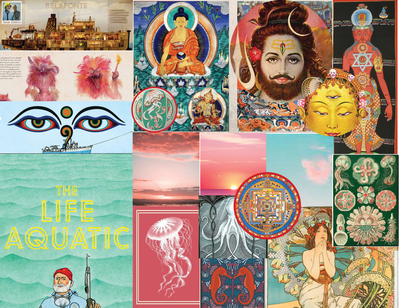
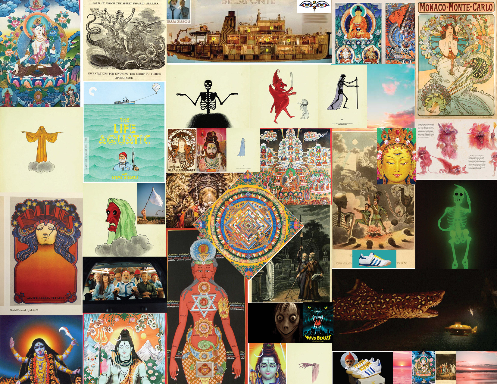
The Life Aquatic alternative movie poster was designed to employ visual metaphor by borrowing the compositional structure of a Tibetan mandala in order to contrast the film's comedic absurdity with its profound spiritual and emotional subtext.
Procreate timelapse video of the drawing process.
Line art was created and then separated into four layers, each with 1 specific color. Using Procreate a combination of additive and subtractive techniques were used to create the full range of colors and contrast.
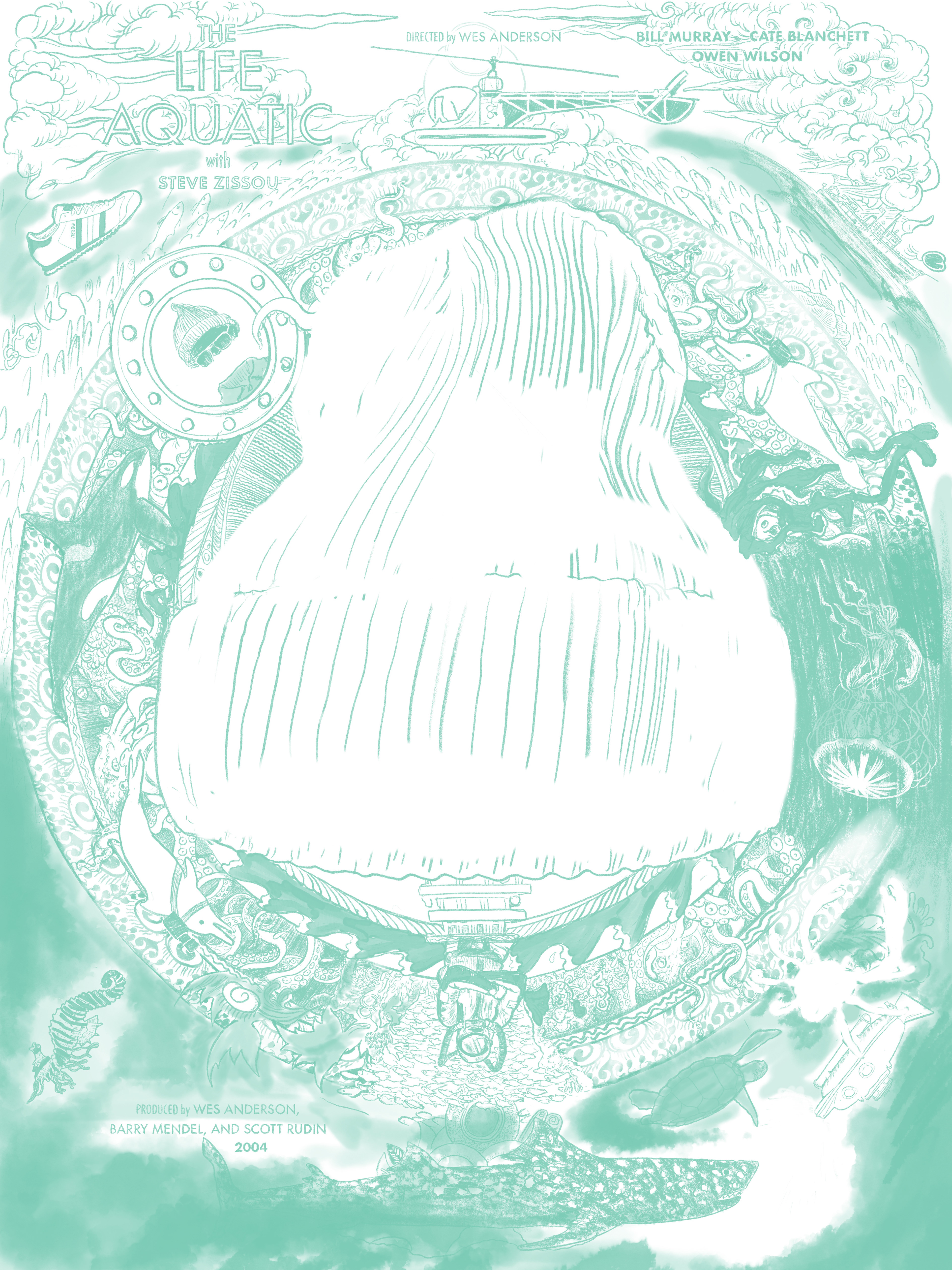
Aqua Layer
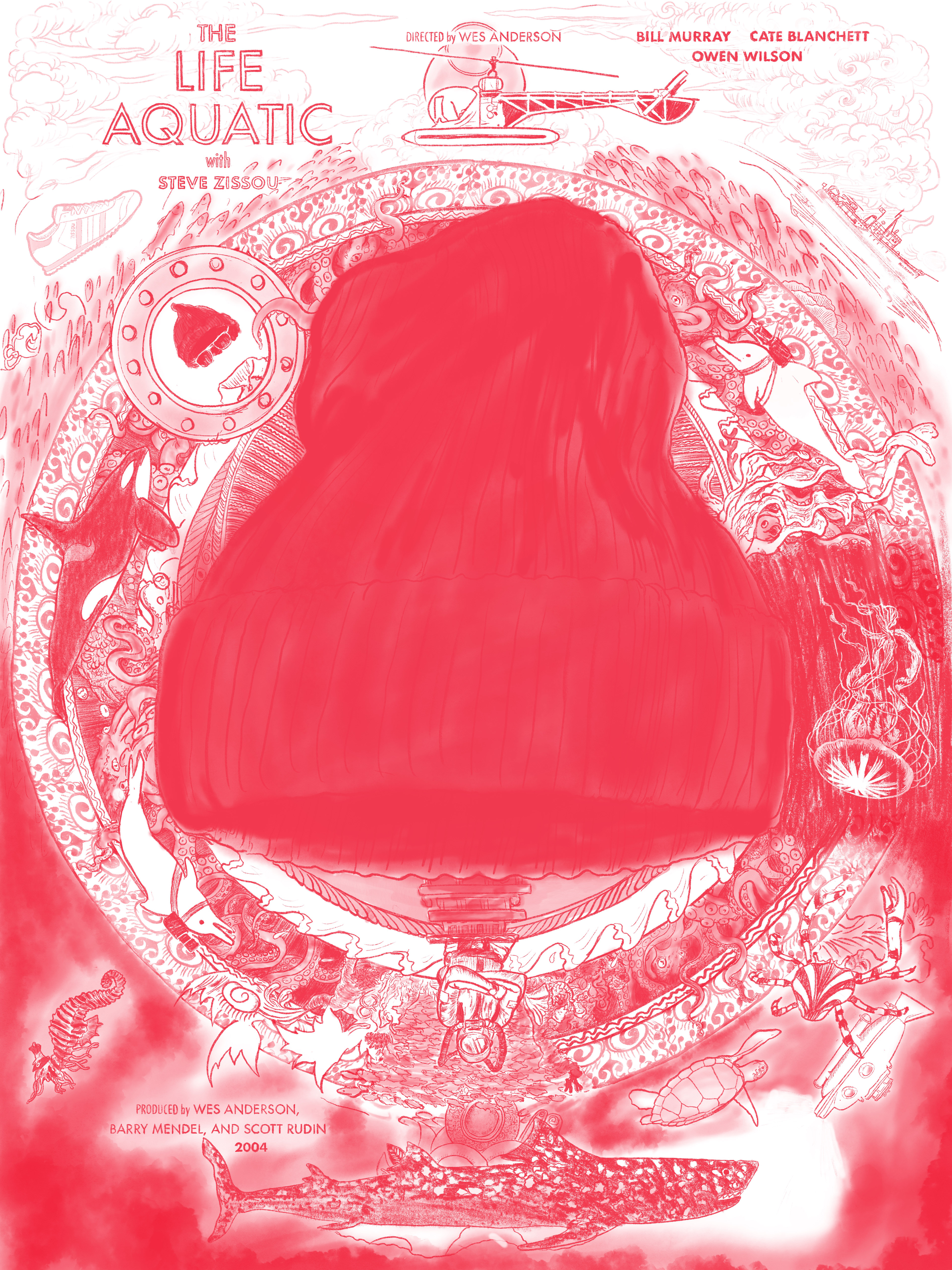
Red Layer
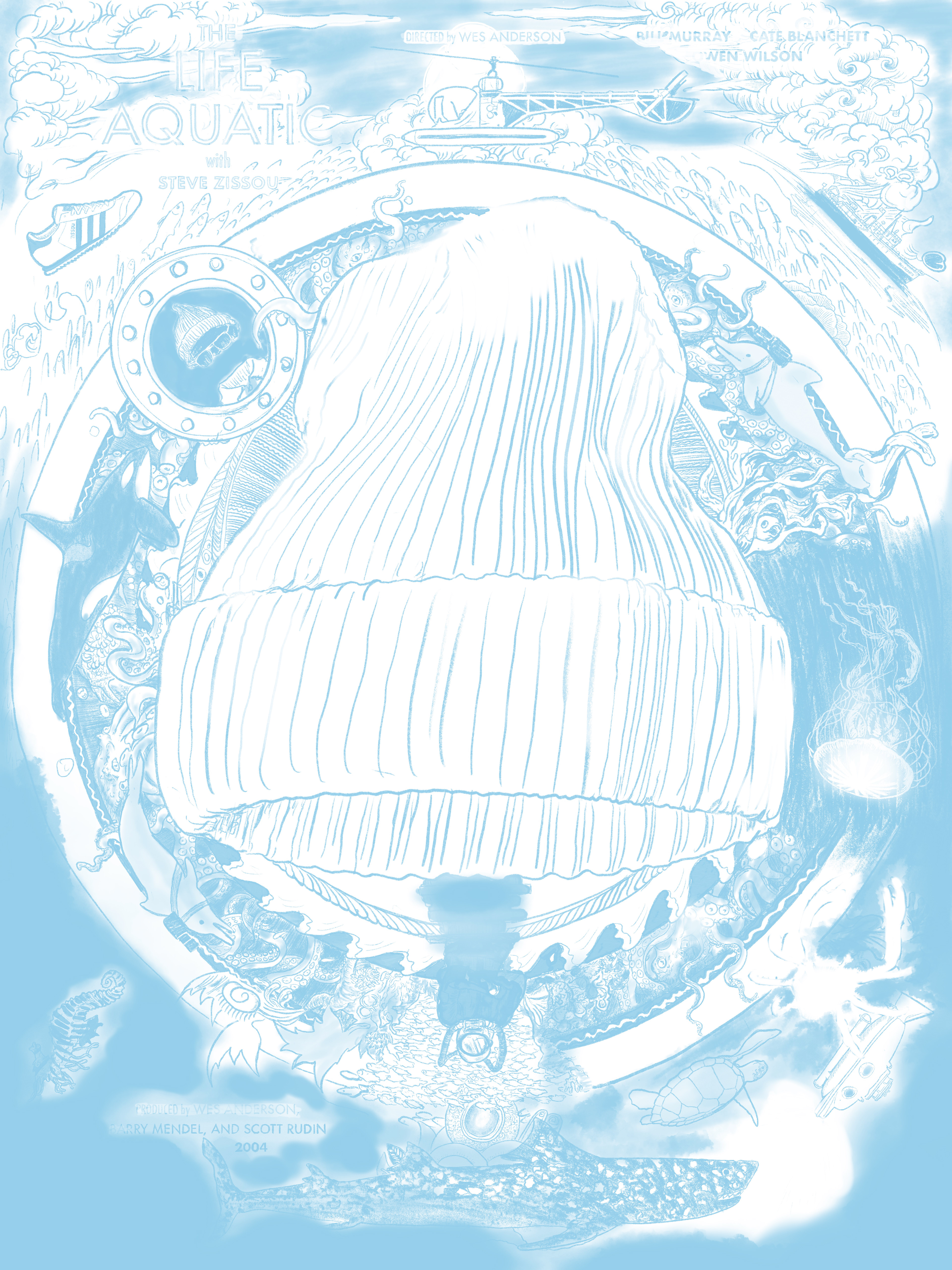
Blue Layer
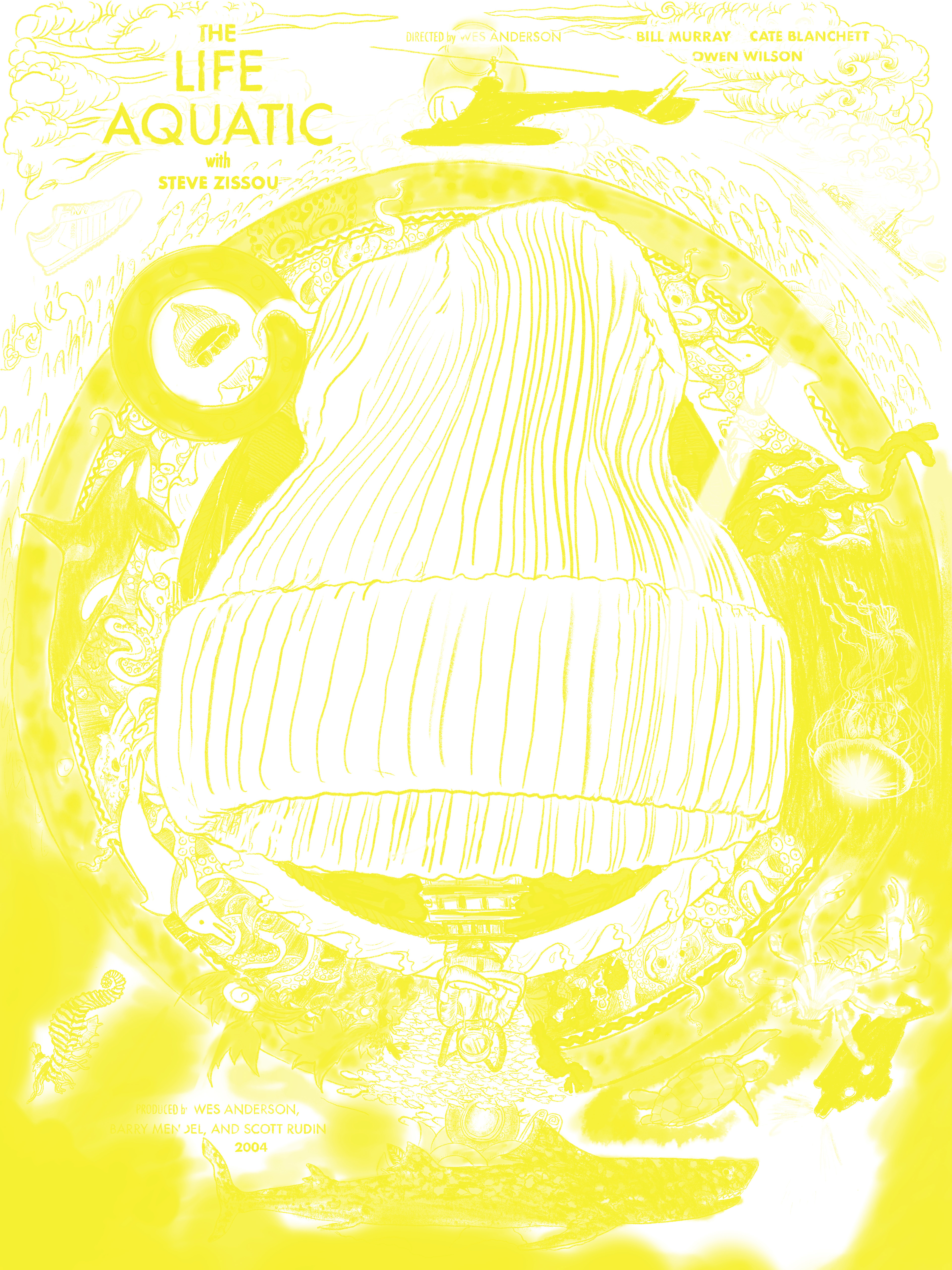
Yellow Layer
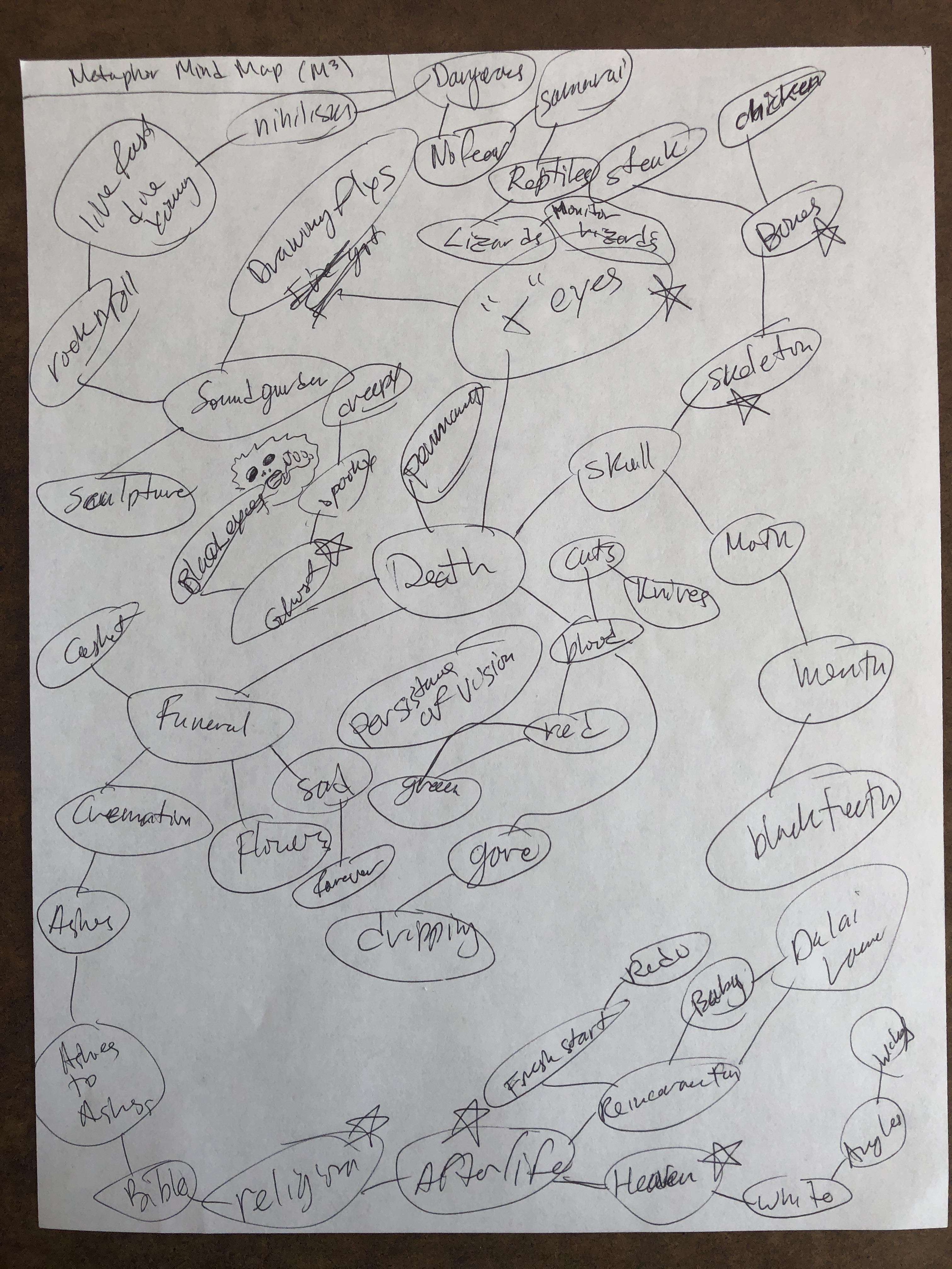
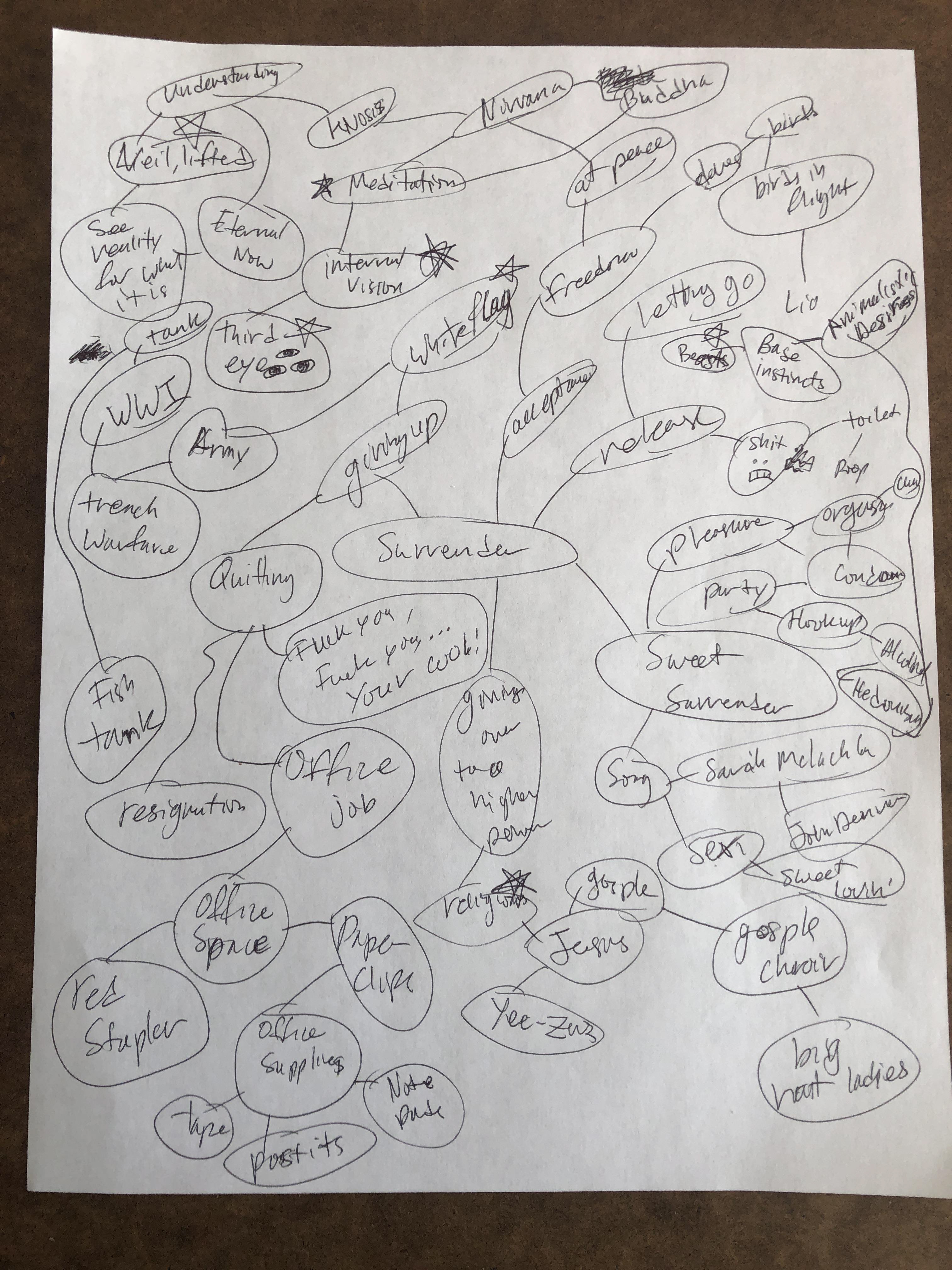
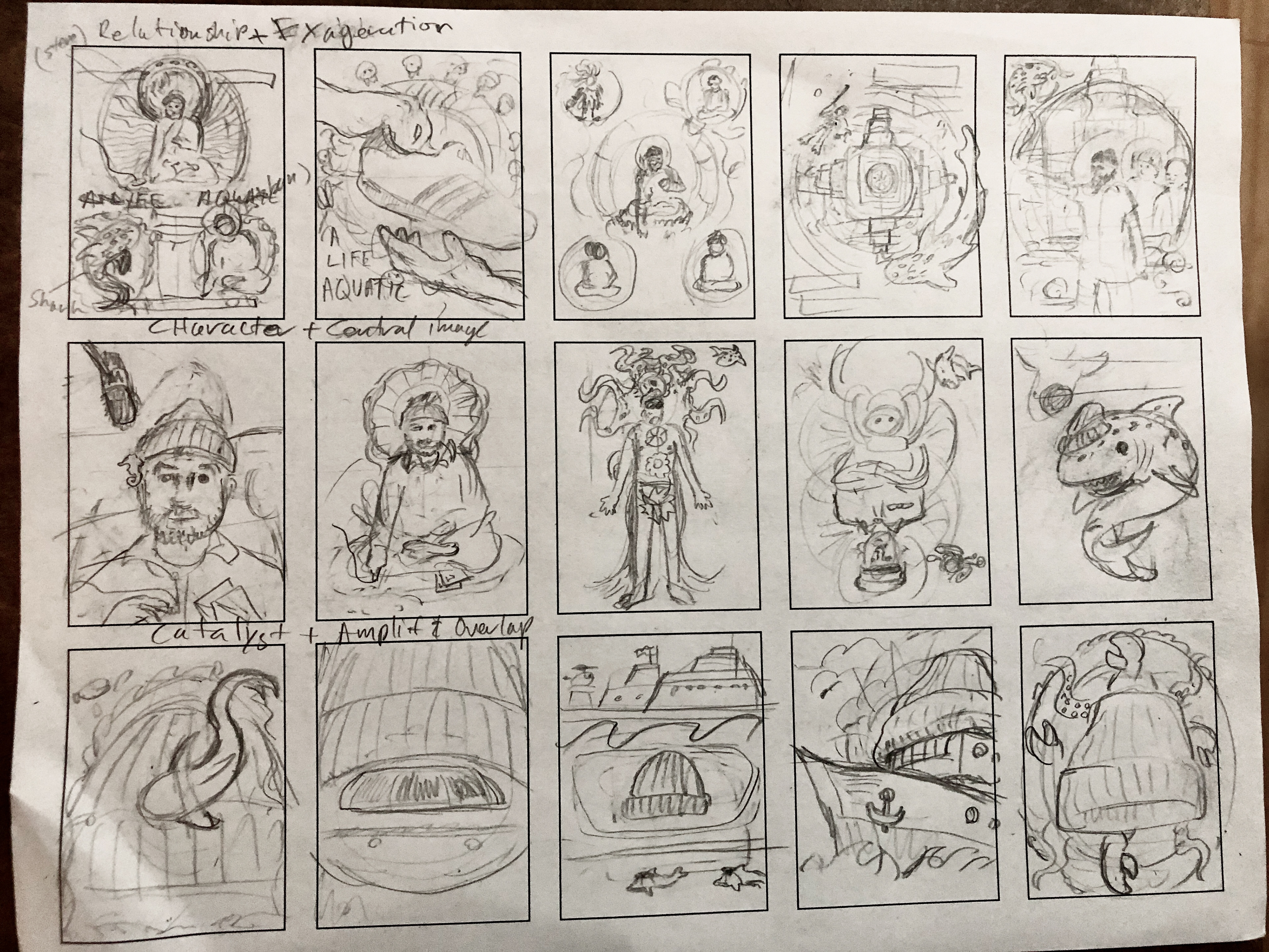
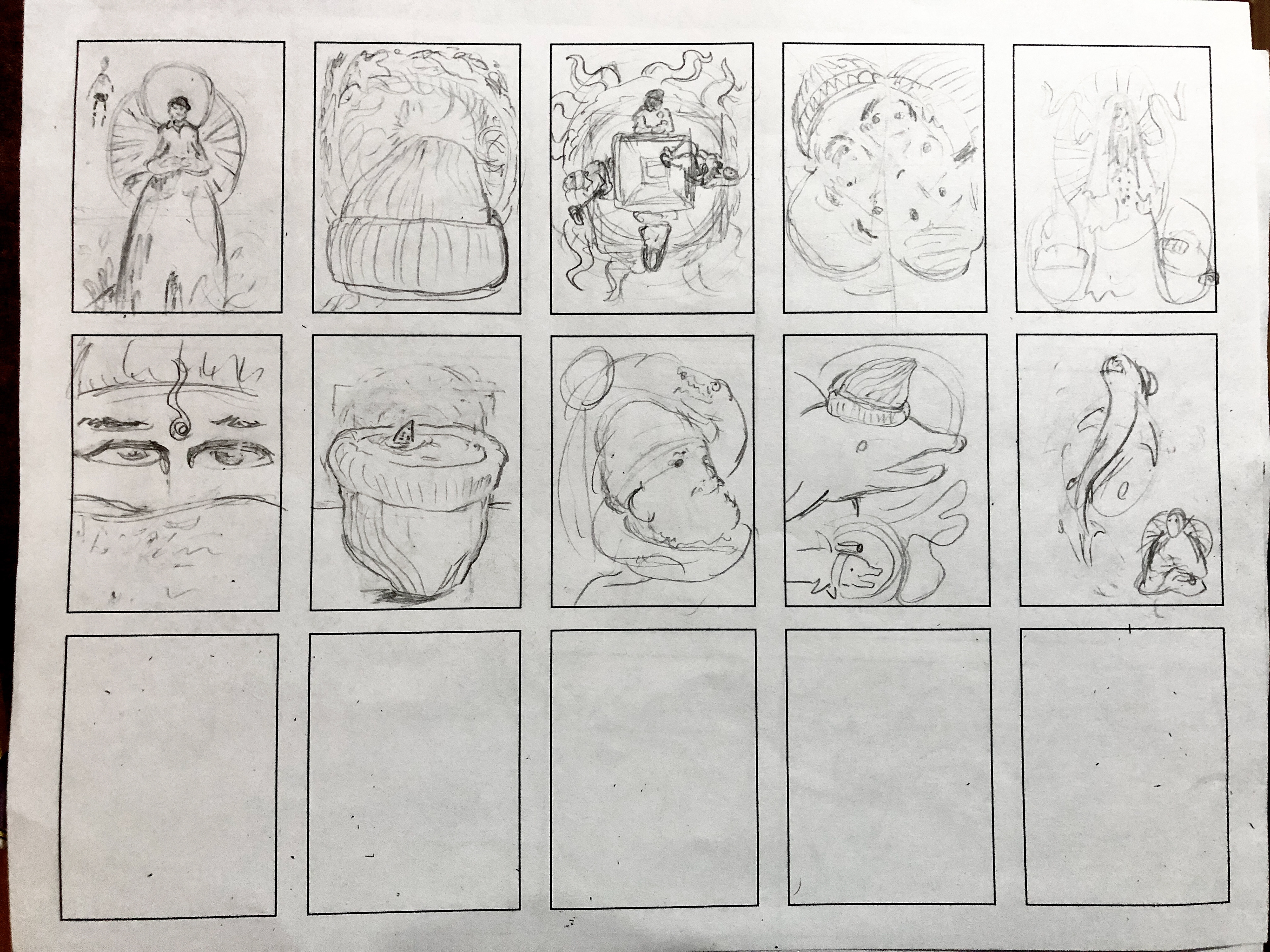
Research and development: In the research and discovery phase of creating this poster, the first step was to re-watch the film, read the script and make notes of interesting dialogue. Step two was mind mapping and creating forced connections to find unique visual imagery. The third step was to explore the subject further by creating a visual style moodboard as well as a visual metaphor moodboard. The final step was to explore compositions by creating a series of twenty-five thumbnail sketches.
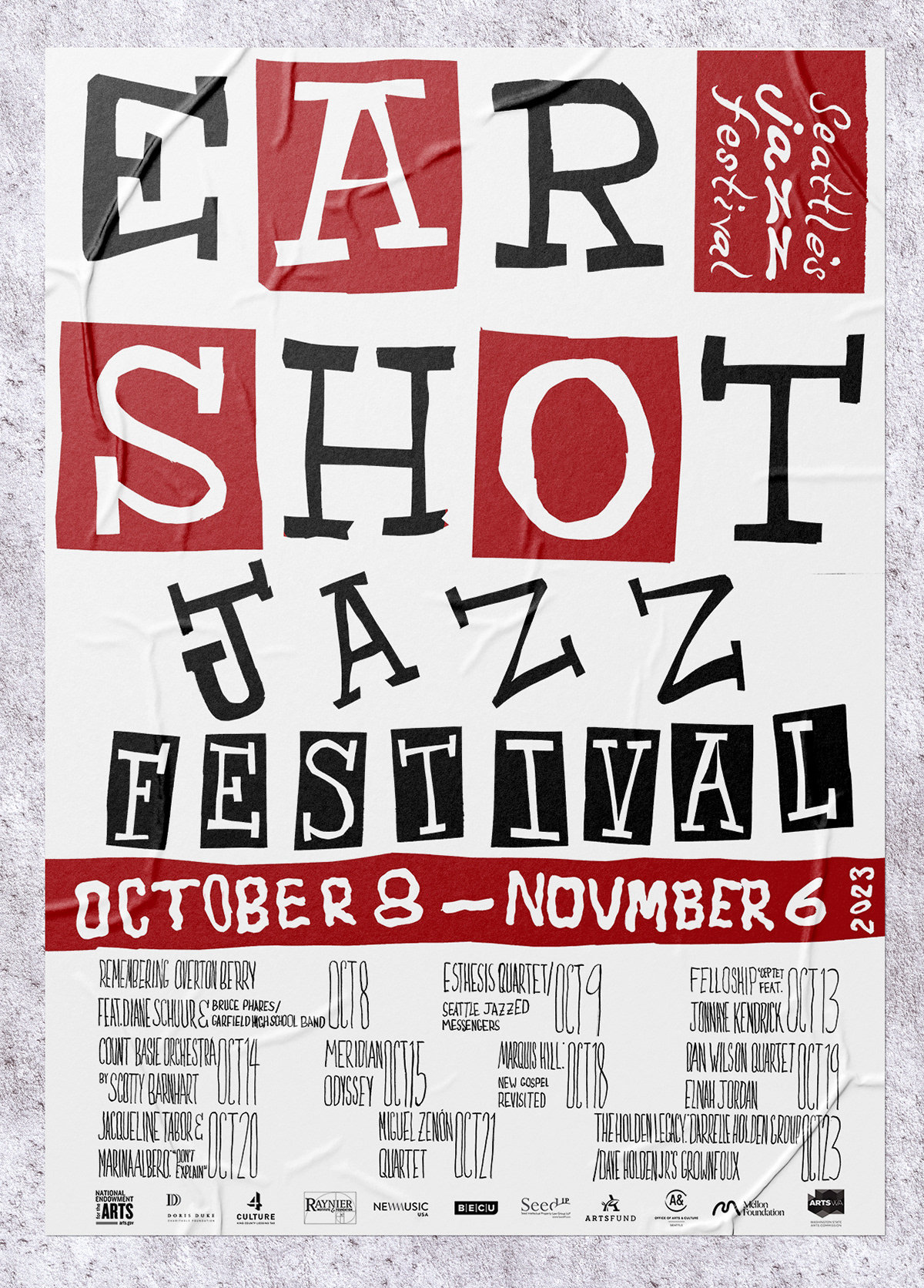
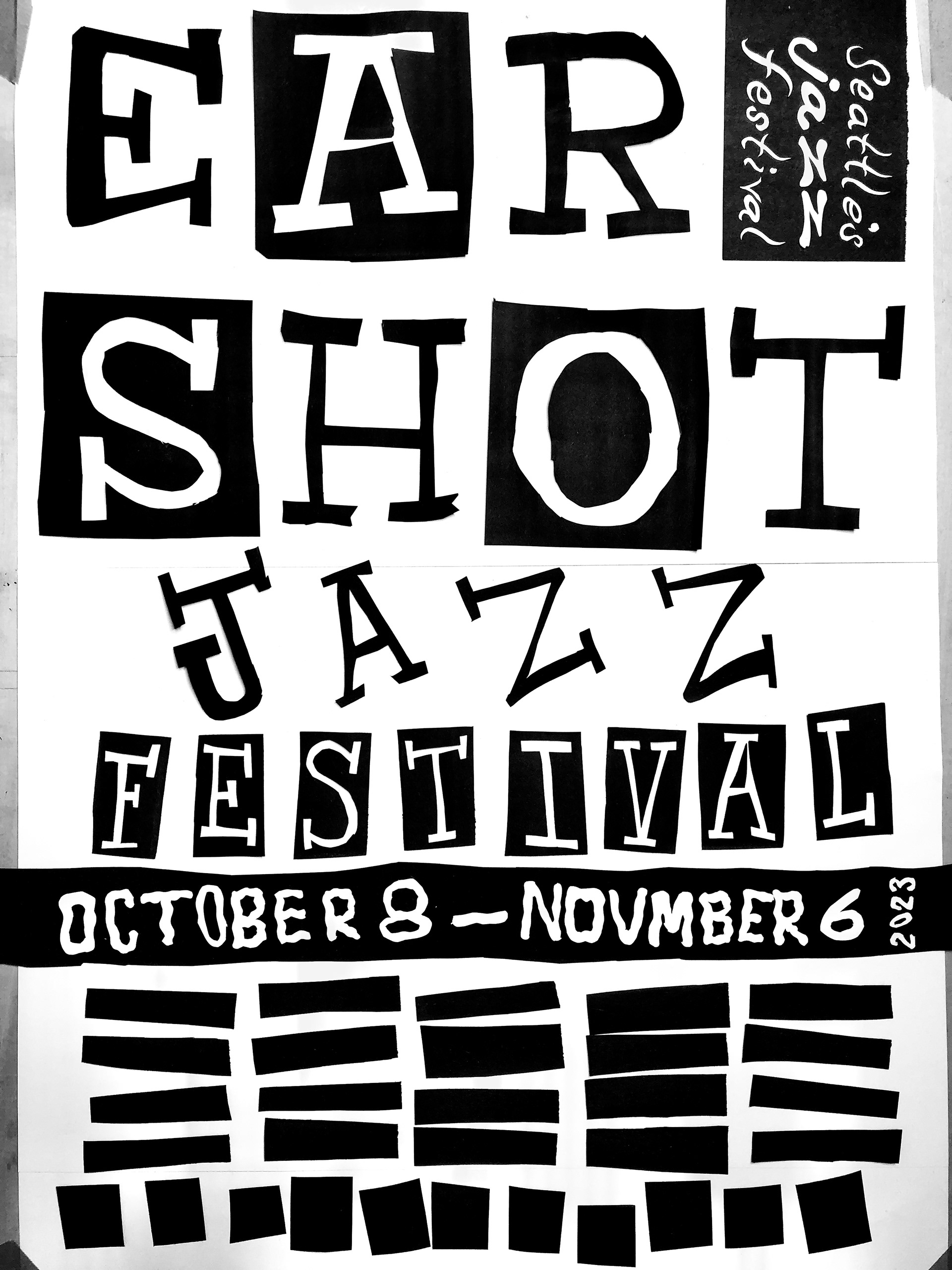
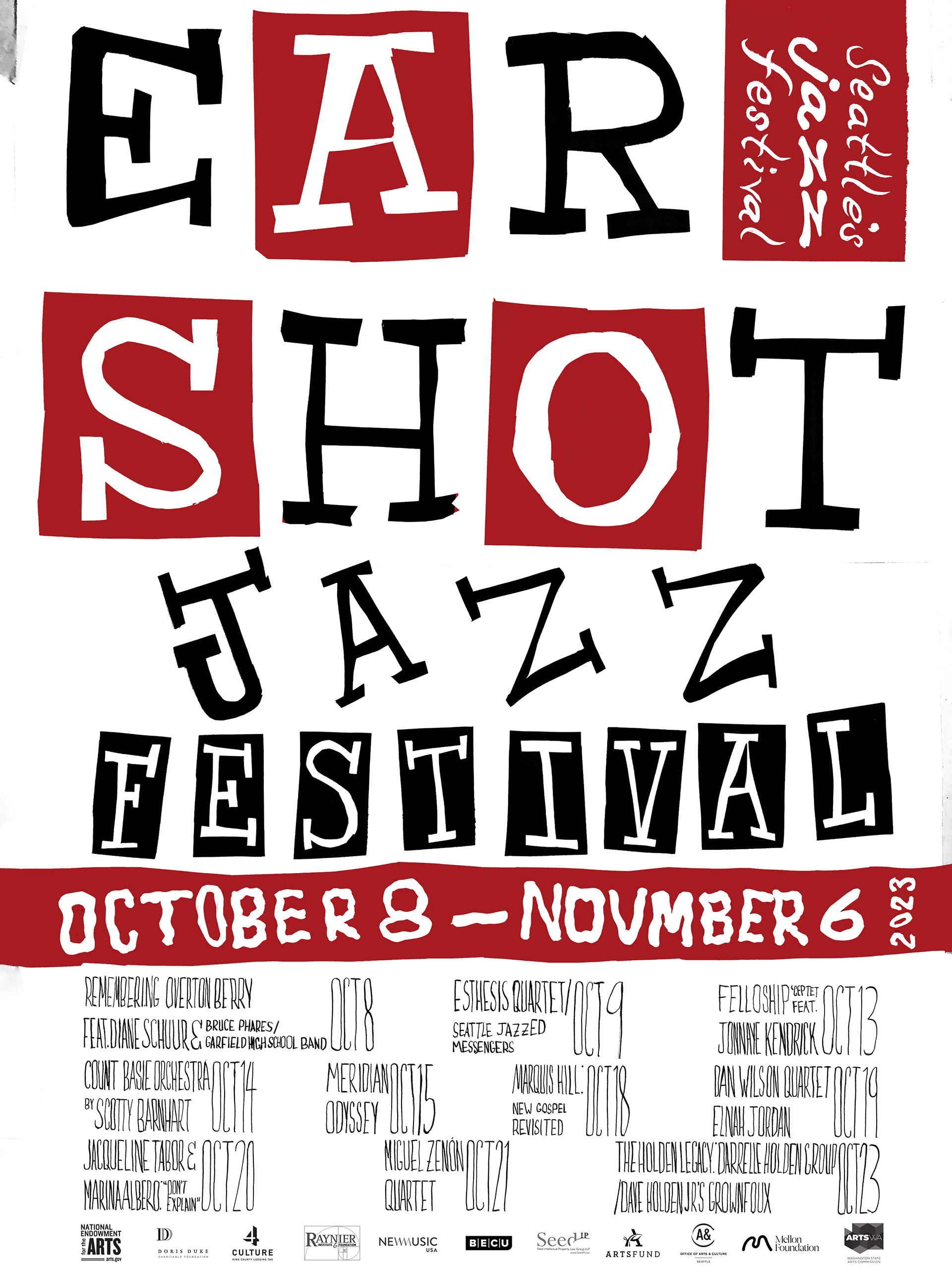
Ear Shot Jazz music festival poster, 2023, 18"x24", 2 color, created using cut paper, india ink, minor editing, color and logos added using Adobe Photoshop
The Ear Shot Jazz Festival (ESJF) poster was crafted to employ visual metaphor in order to convey a sensual element of the ESJF experience. The objective was to attract demographics that have historically been underrepresented at ESJF events, while still appealing to the regular attendee that comes back year after year.
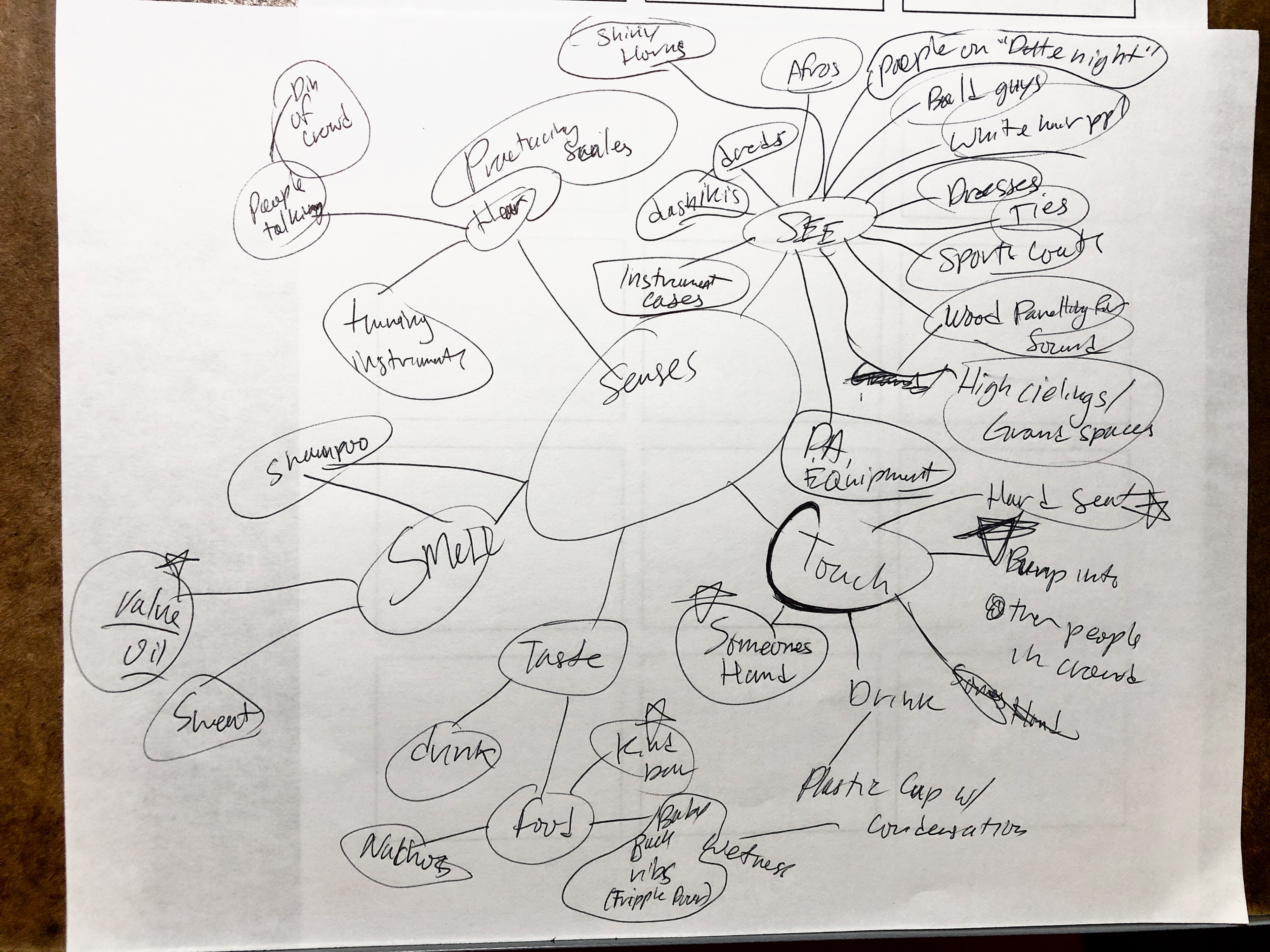
Sense Association Mindmap 1
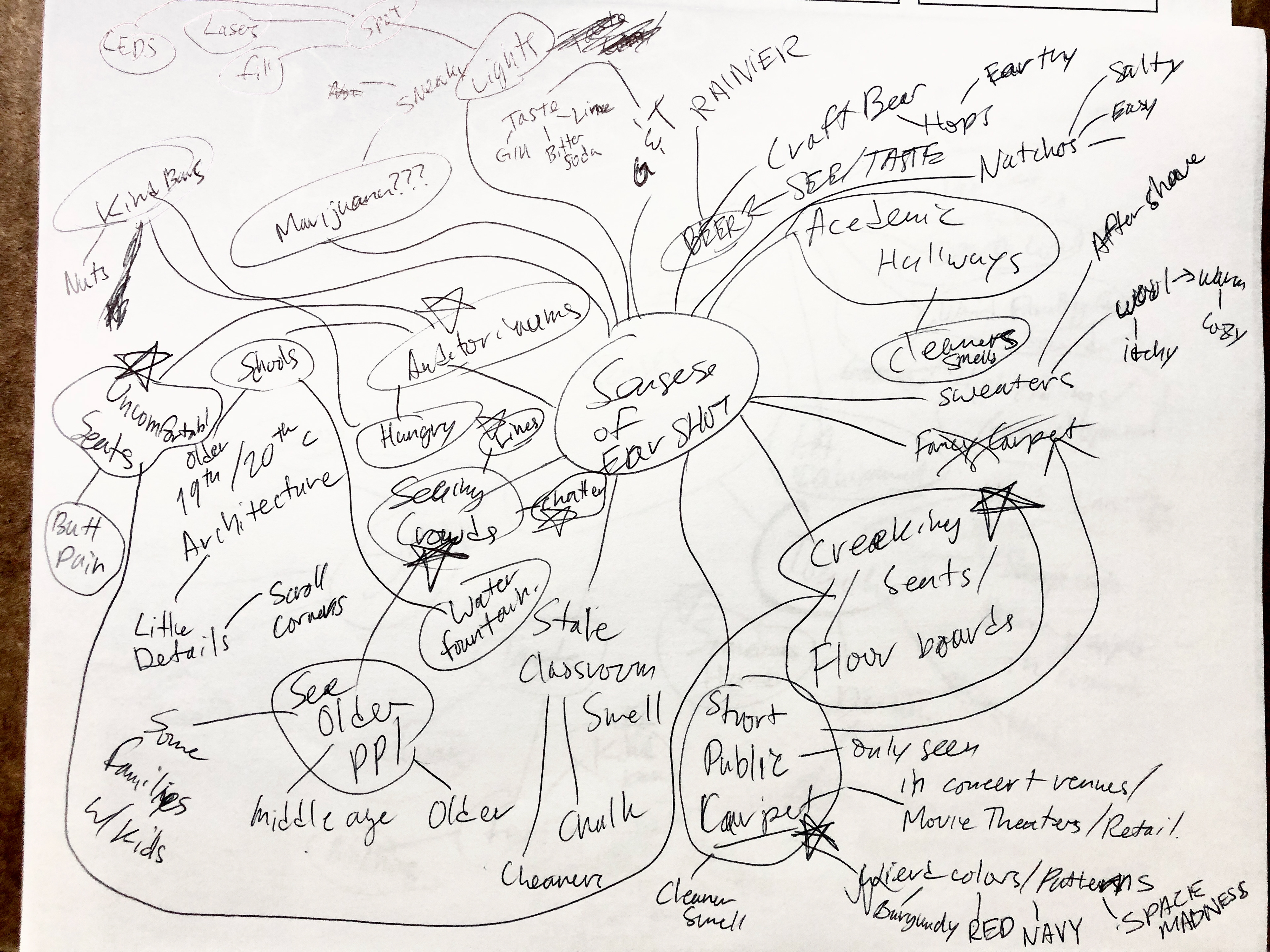
Sense Association Mindmap 2
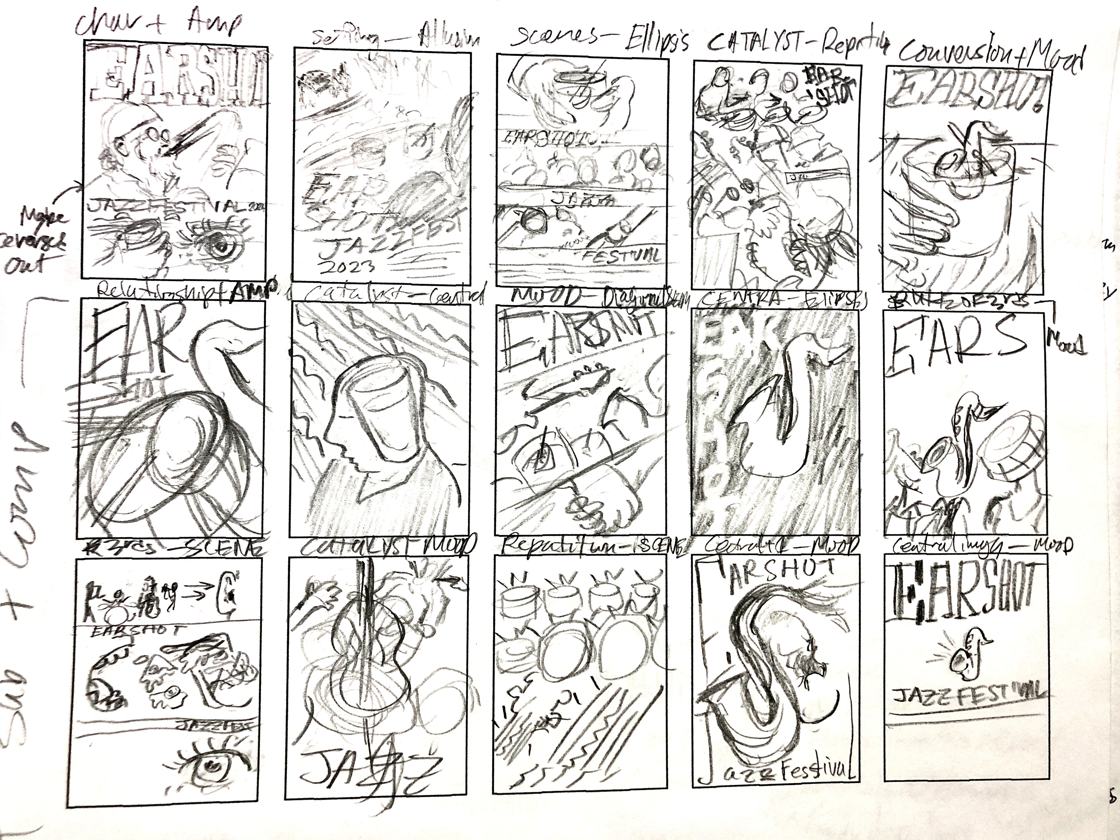
Jazz Fest Thumbnail Sketches 1
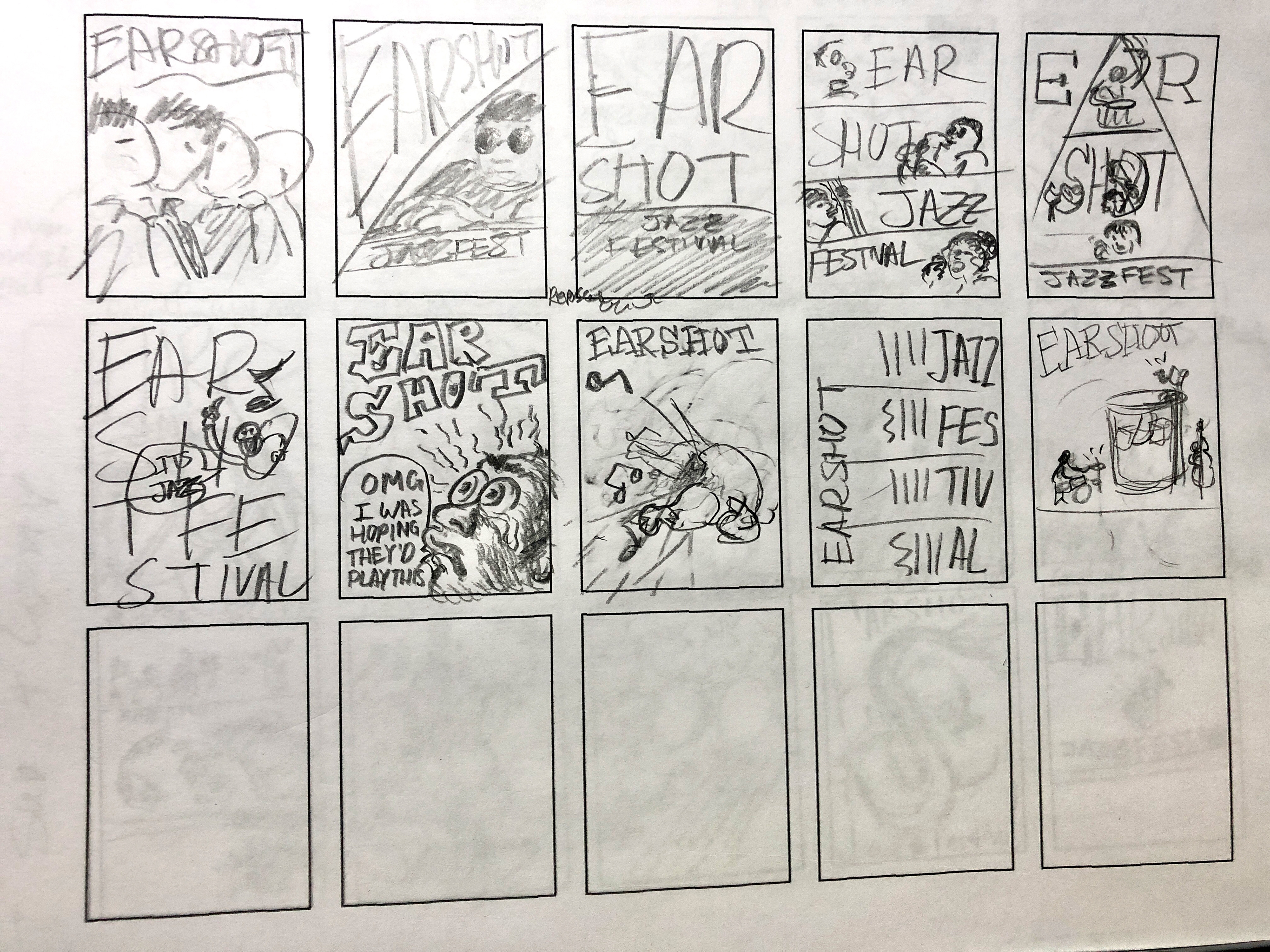
Jazz Fest Thumbnail Sketches 2
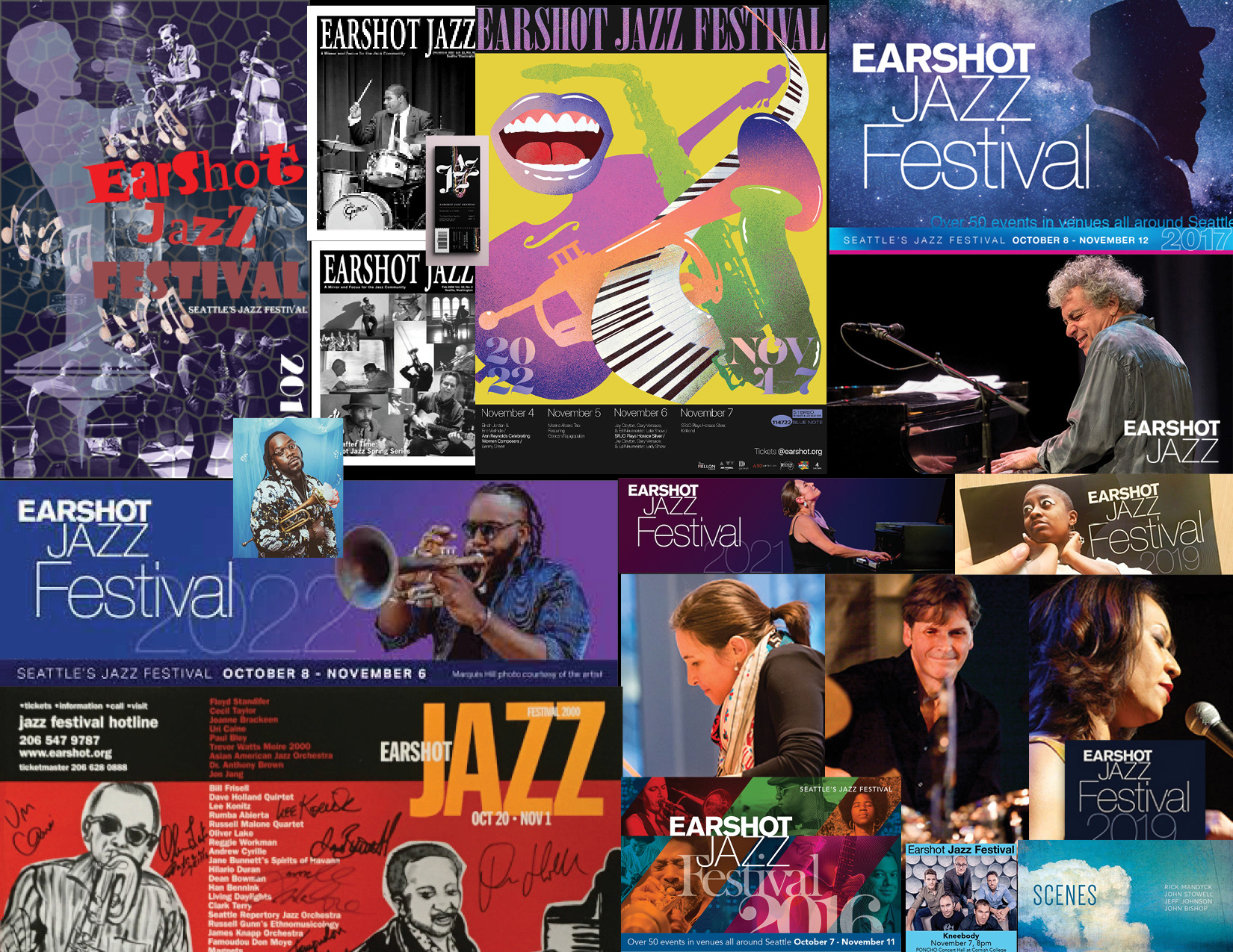
Ear Shot Jazz promotional materials from the past.
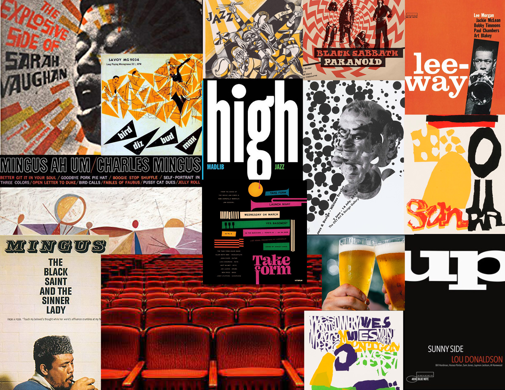
Inspirational Jazz and music related imagery.
Research and Development: To design the poster for Ear Shot Jazz Fest, the initial step involved researching the event's history and the demographics of its past attendees. Then, two mindmaps were created to explore the sensory experiences associated with Jazz Fest, aiming to establish a stronger connection between the visual aesthetic of the poster and the festival's audience.
The next step was to review the existing promotional materials Ear Shot Jazz Fest had used in the past. They were somewhat uninspired and had room for improvement. Next, visuals from other jazz events and albums (as well as other related genres) were researched to gather interesting ideas to play with. Then two moodboards were created, one of inspiring visual assets and another of past visual assets.
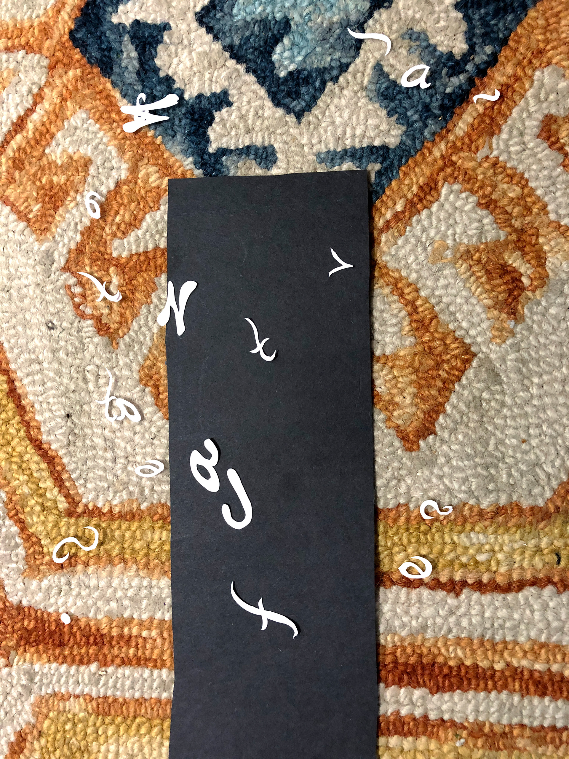
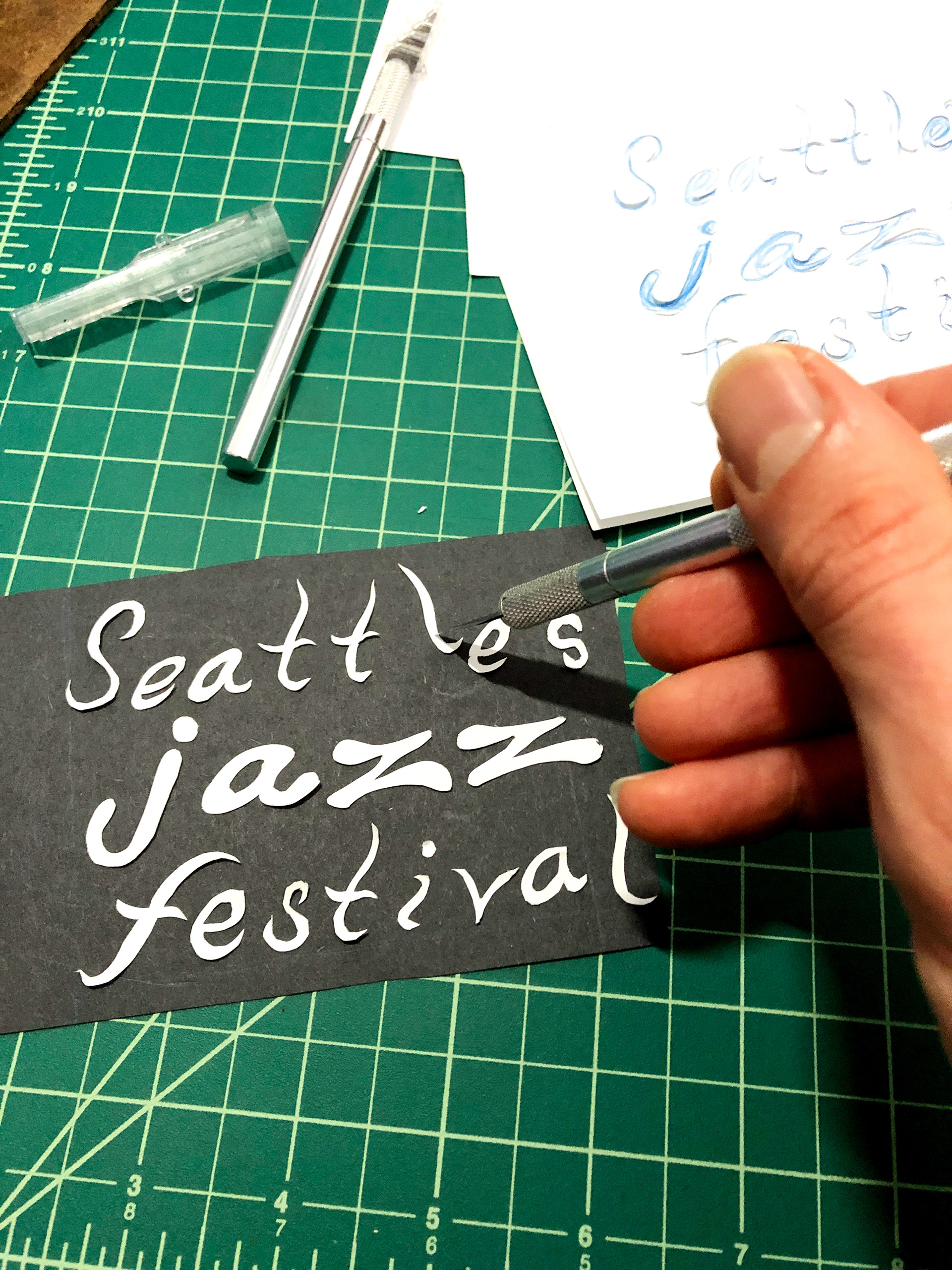
Process: Drawing inspiration from mid-century poster and jazz album cover design. An analog cut paper method was landed on for the final execution because the rough, immediate nature of the hand-touched letter forms recalled the improvisational aspects of jazz music. The modular nature of hand-cut paper lettering enables quick iterations and seamless adjustments based on critical feedback. Finally, the lineup was hand lettered using a bamboo dip pen and India ink, then scanned and added to the original hand-cut text section, along with the red spot color using Photoshop.
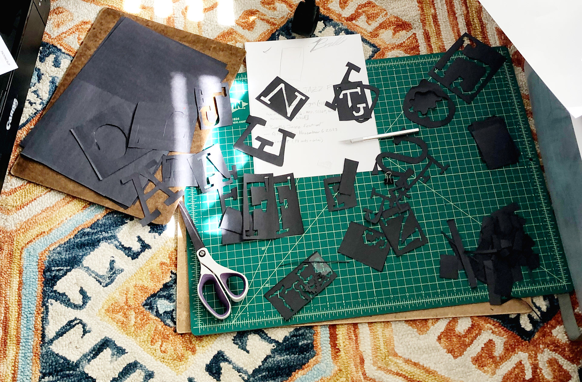
Cutting out letters on the floor
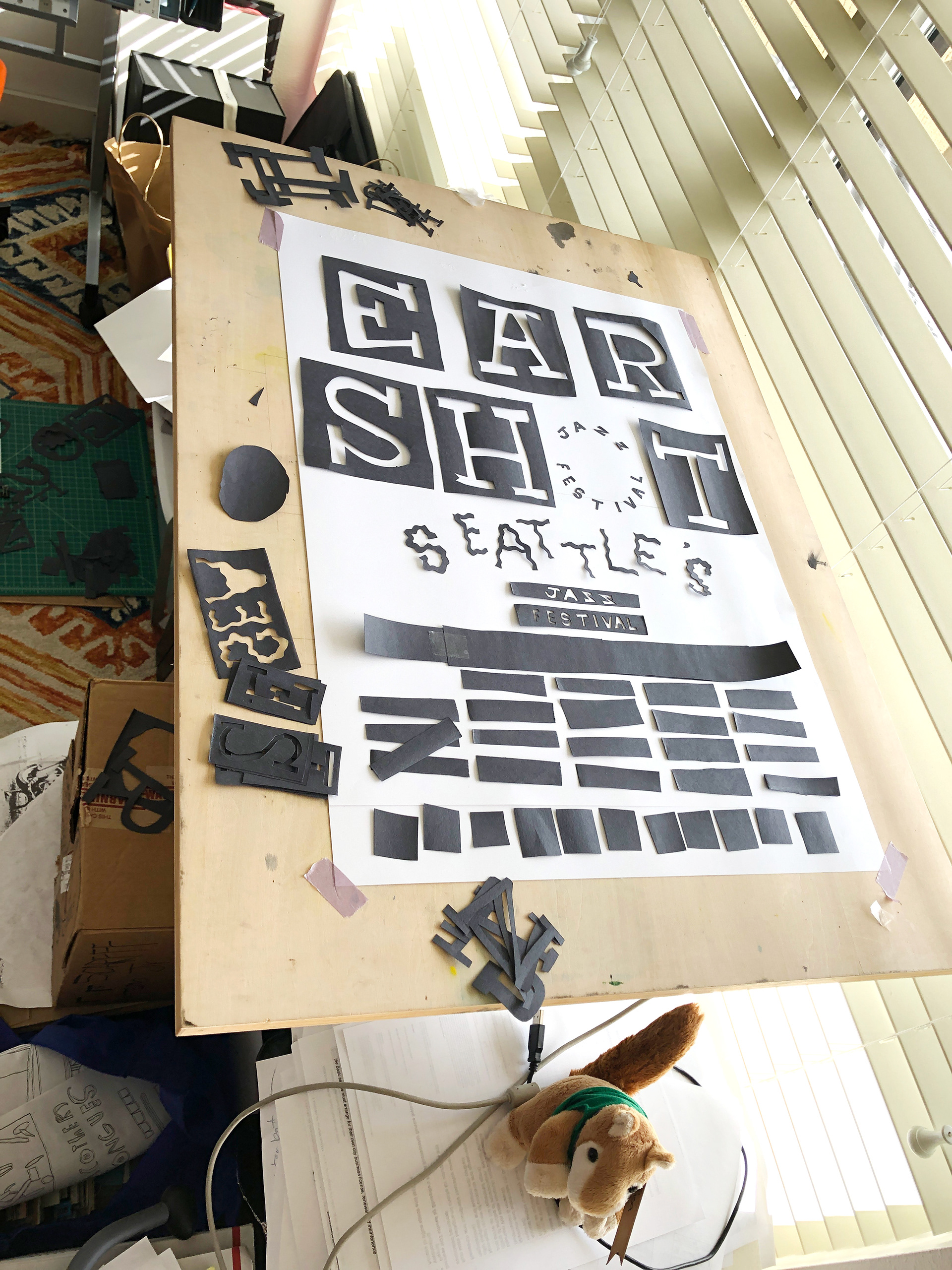
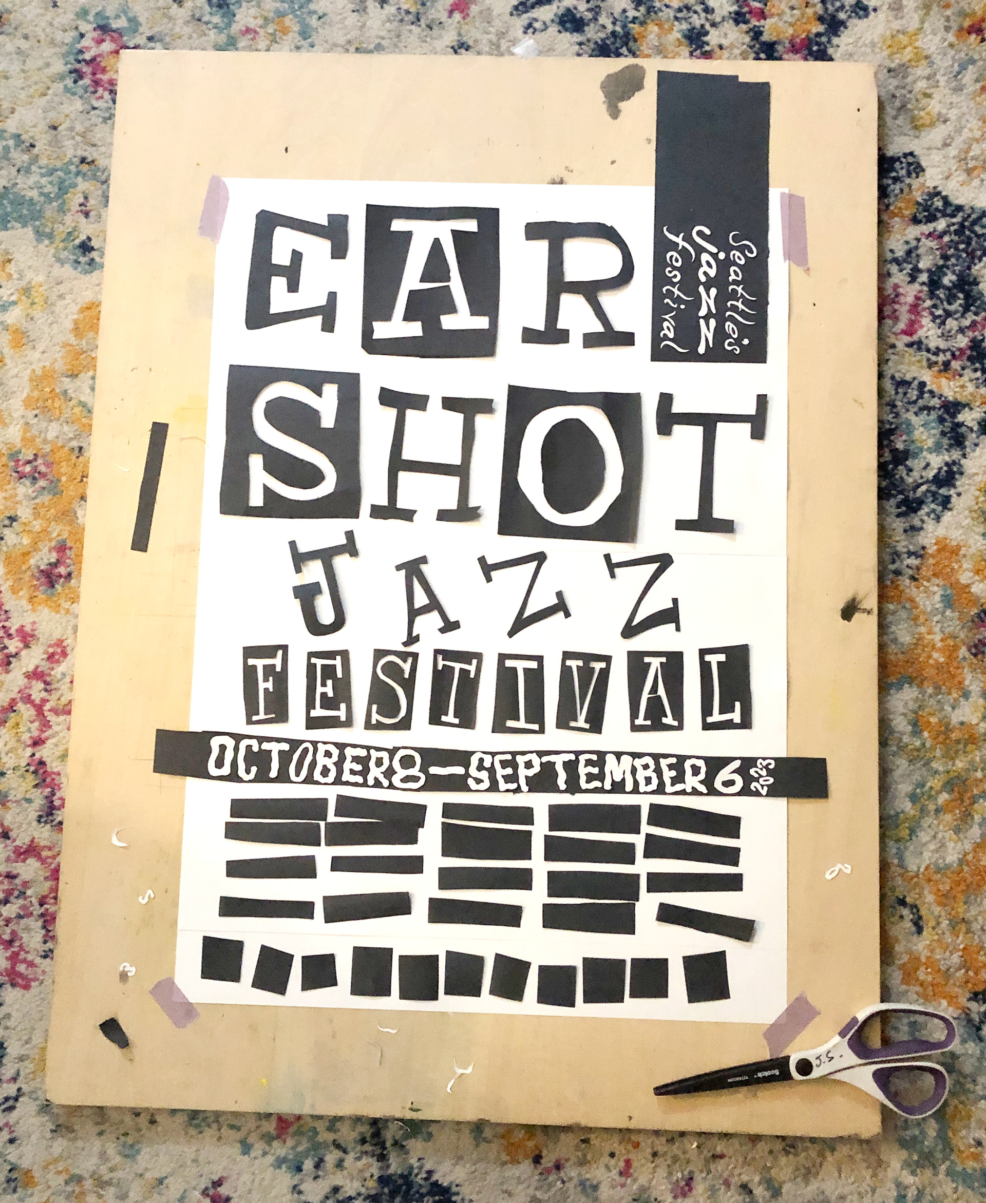
Cut Paper Type Poster Iteration 1
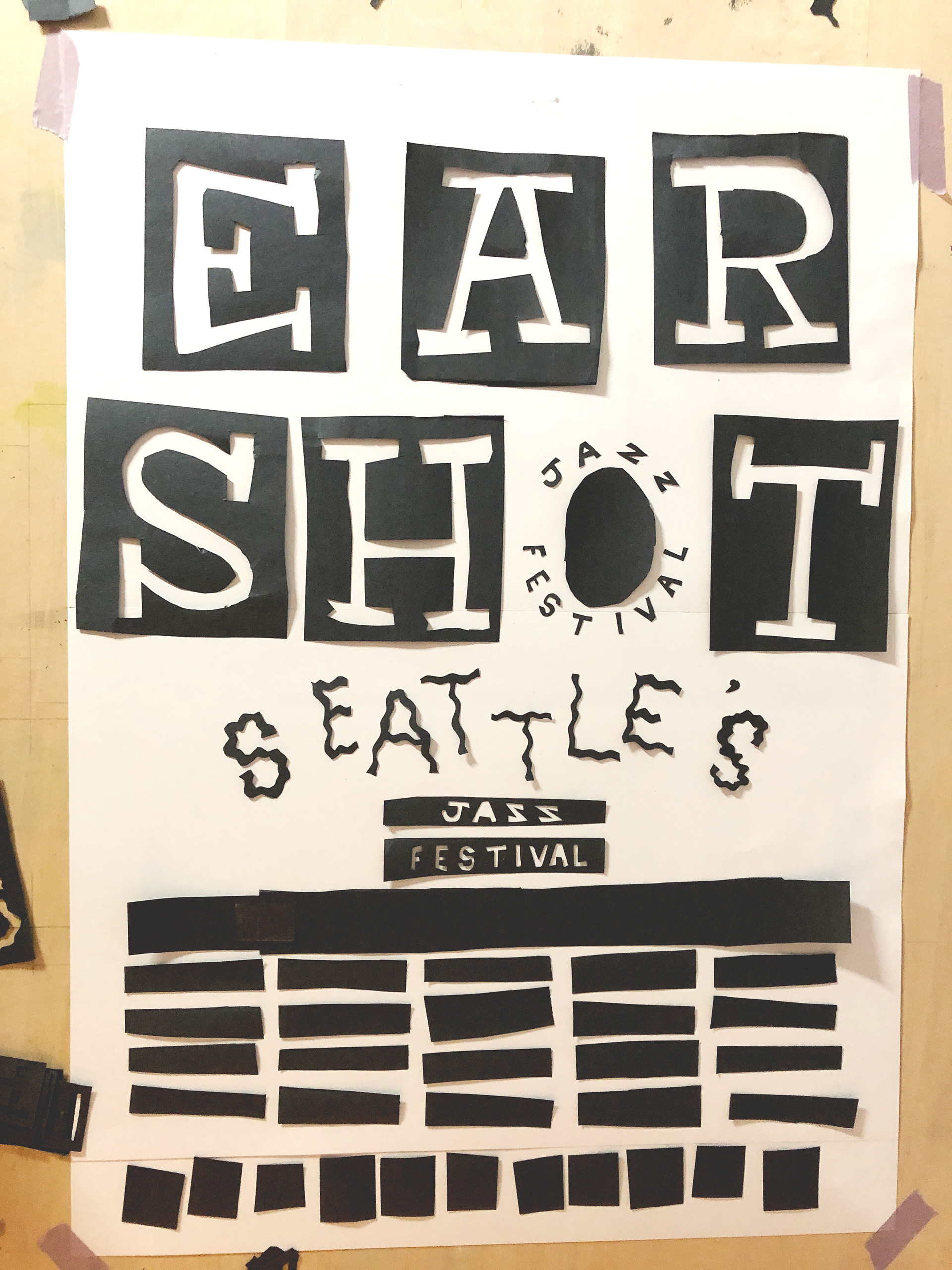
Cut Paper Type Poster Iteration 2
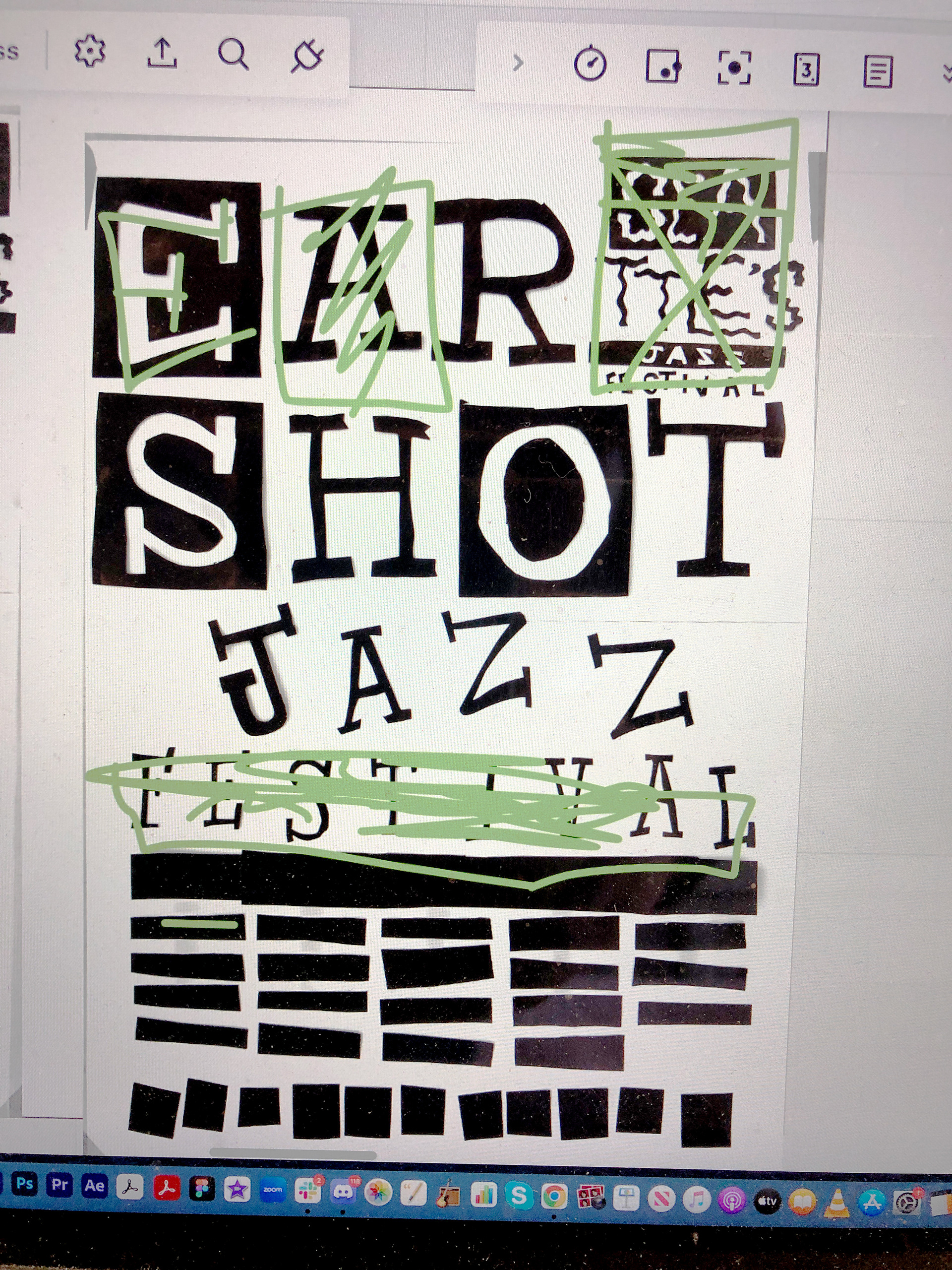
Critical Feedback
This can happen if you sneeze.
Arranging new letters.
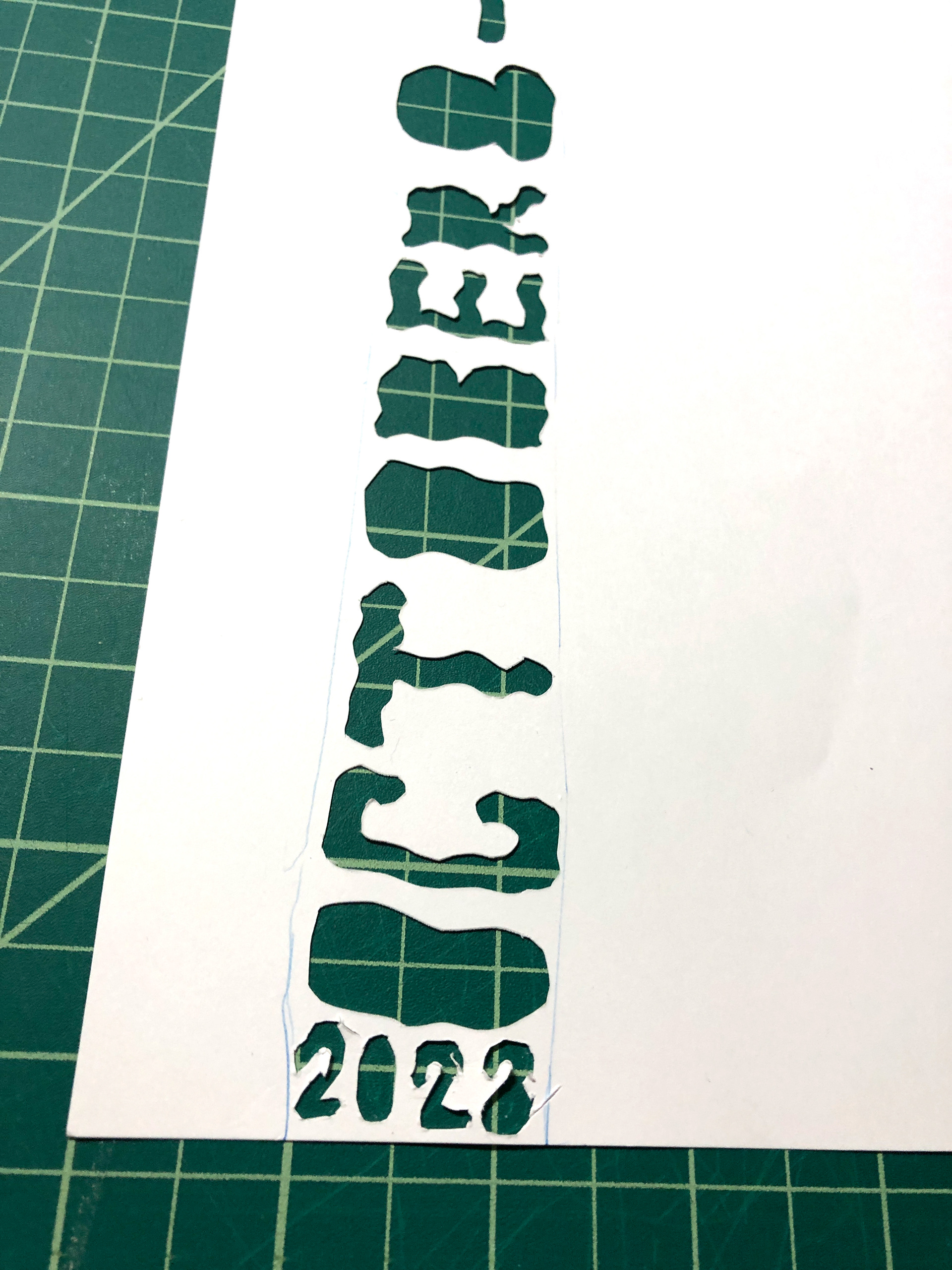
Multiple letter forms were created to increase visual interest.
Final composition: unprocessed
FInal Compostion
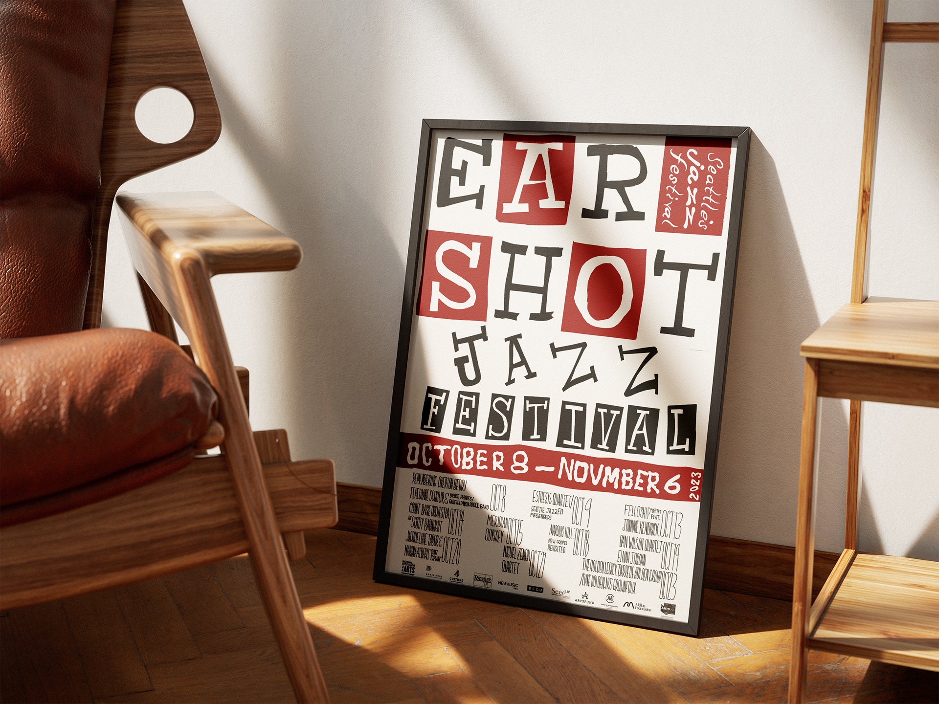
Final Poster, with spot color and handed lettered schedule.

Cuts of a Pig: Swiss style poster
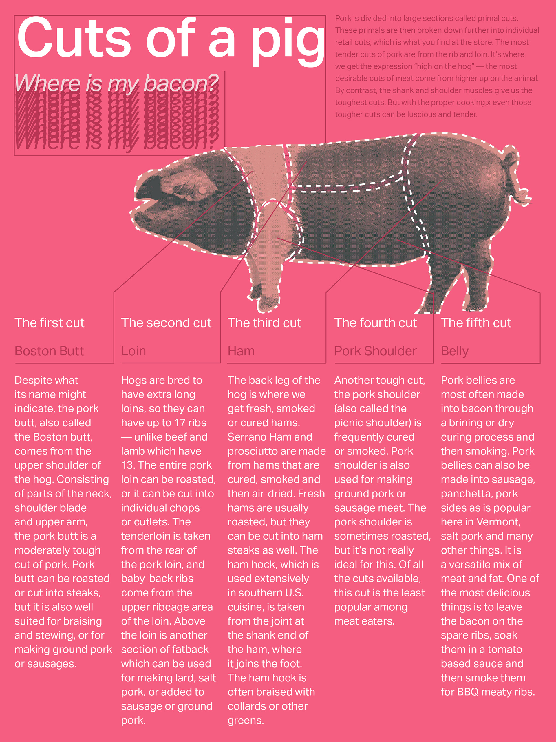
The Cuts of a pig poster is an exploration of Swiss/Modern design, prioritizing clear communication of information through a well-defined visual hierarchy, clean typography, and a consistent underlying grid structure. Produced using Indesign and Photoshop. This poster is specifically designed to be displayed in butchers or grocers with a butcher counter, serving as an informative visual piece.
5 column grid, typography only
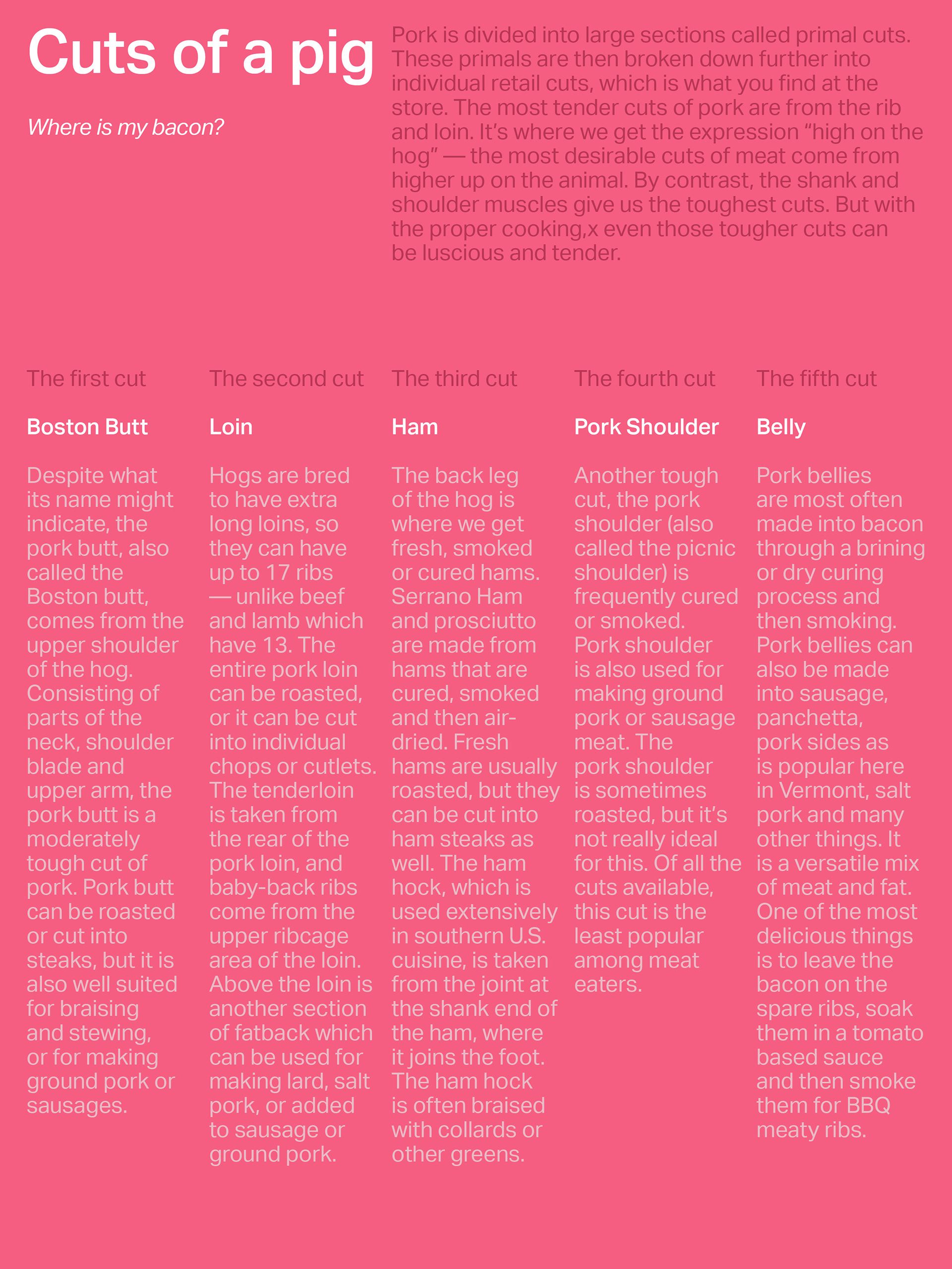
Color palette added
5 column iteration 1
5 column iteration 2
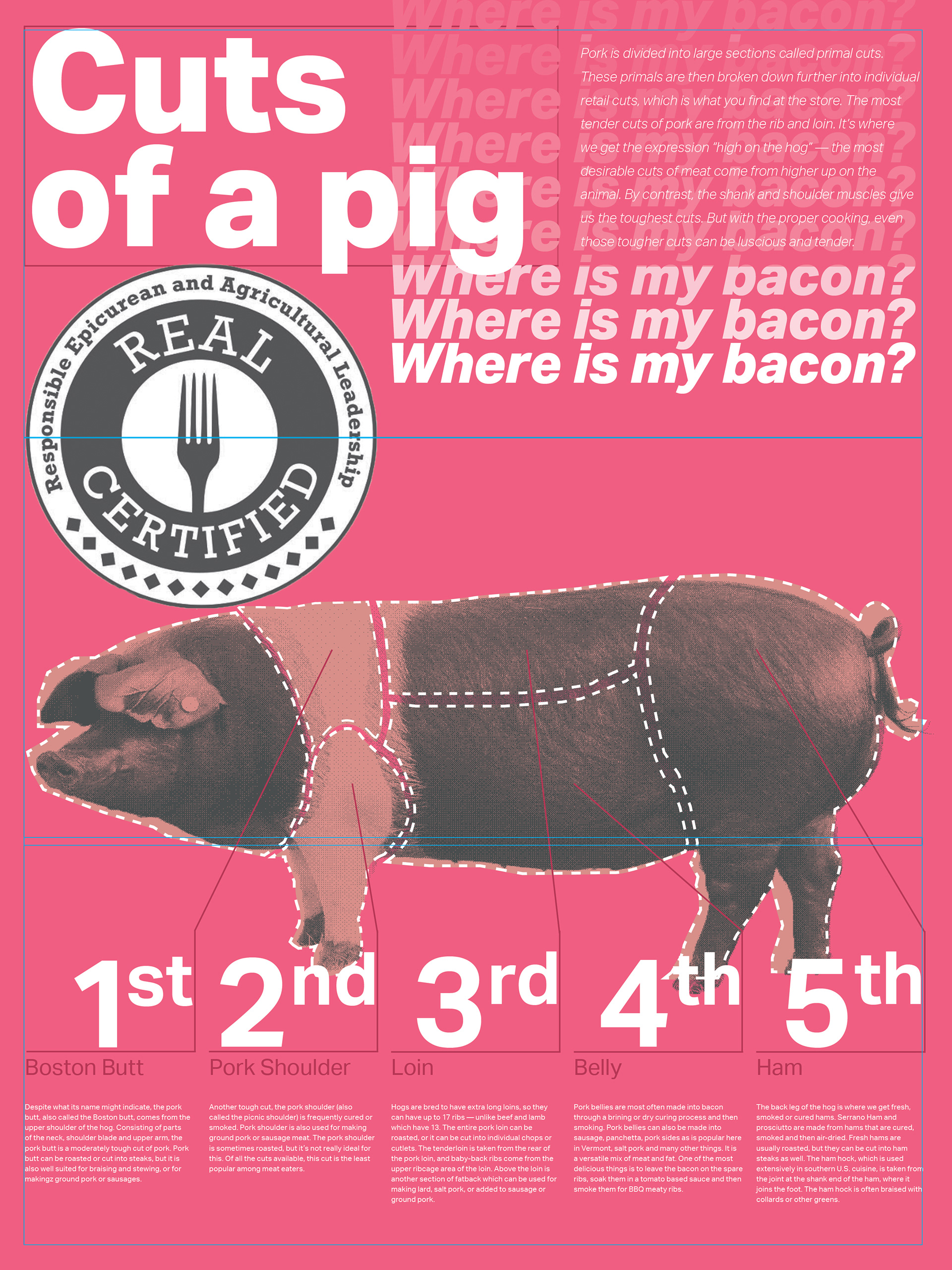
5 column iteration 3
5 column iteration 4
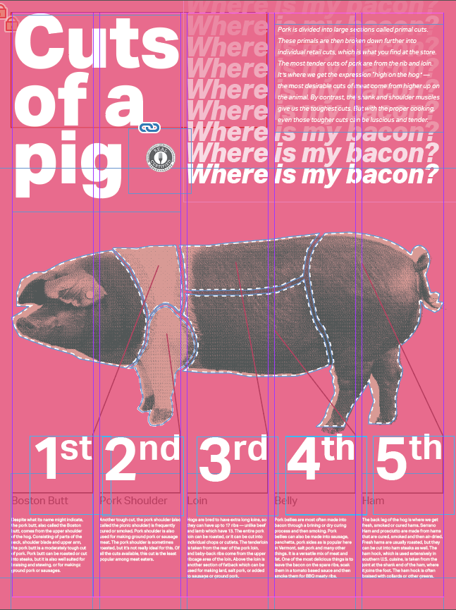
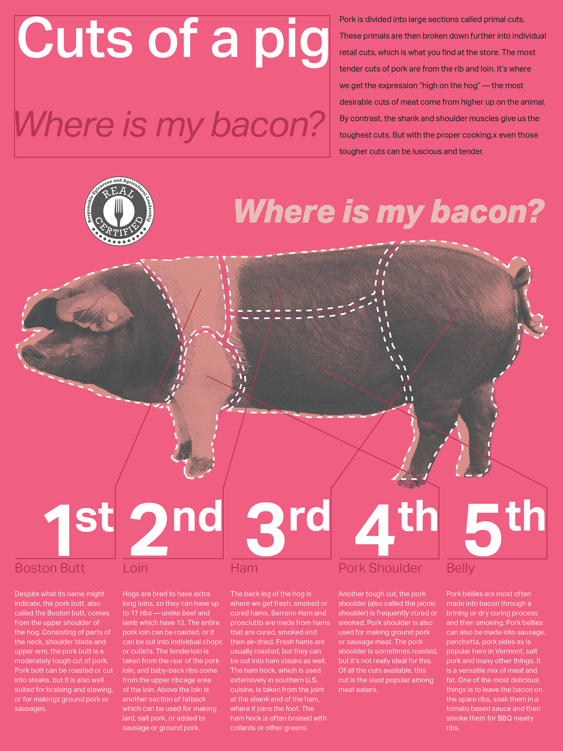
Grid Revealed
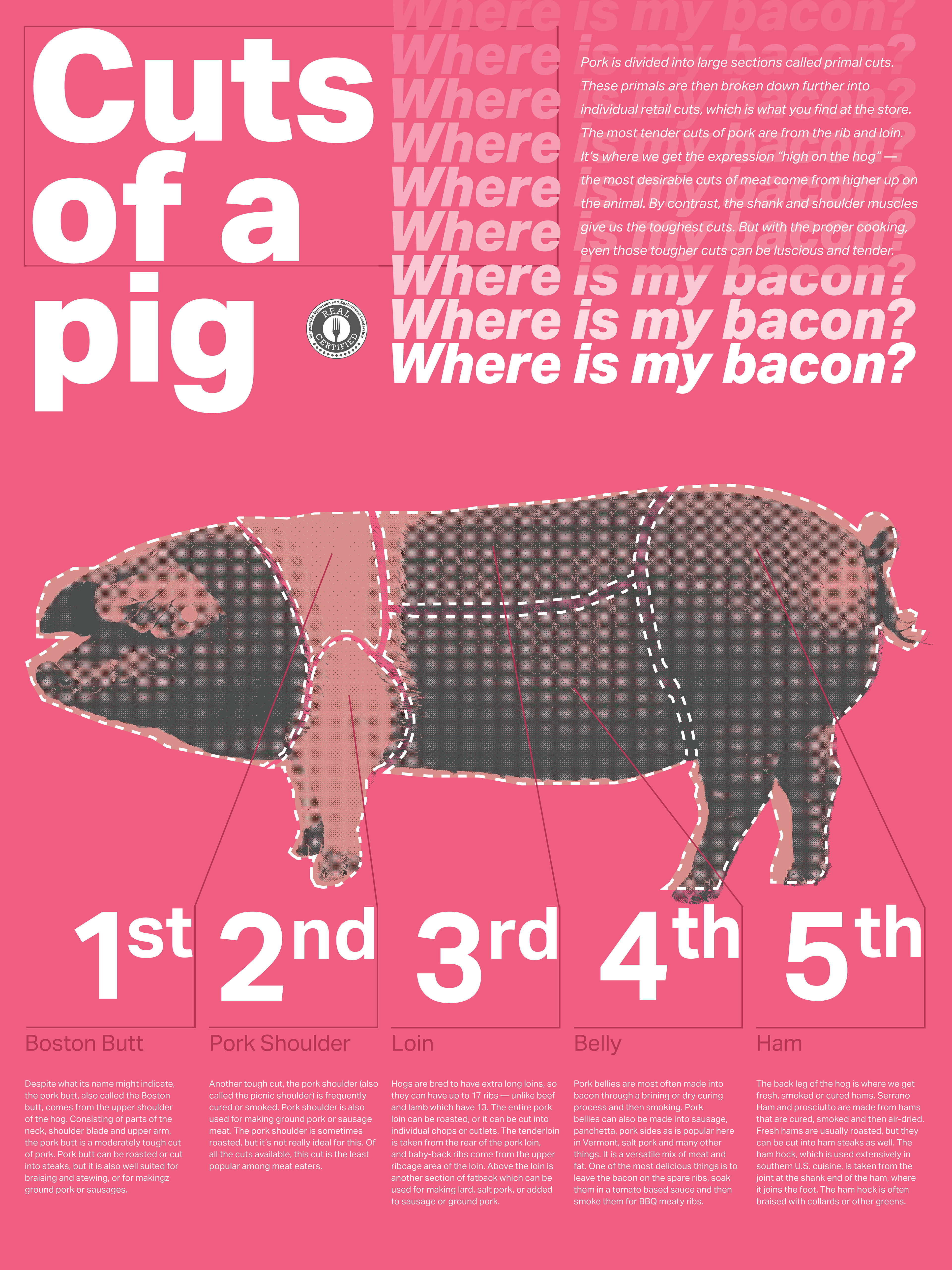
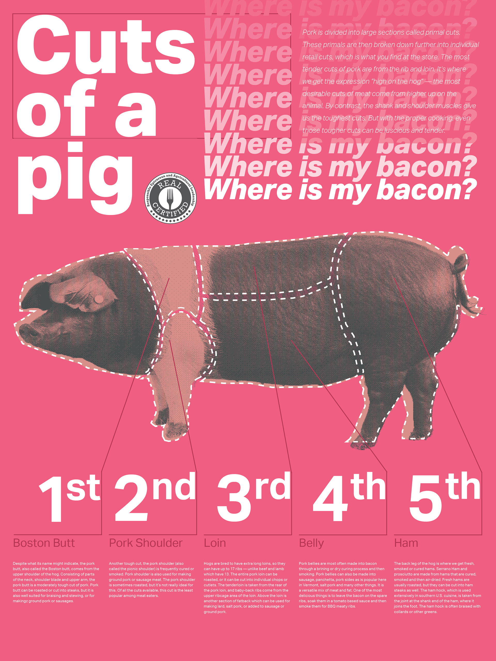
Final version
Process: Following the selection of a five-column grid structure, the design process for the Cuts of a pig poster began by incorporating typography, photography, and the necessary emblems. Through iterative refinement and responsiveness to critical feedback, the design was continuously adjusted until a highly functional, and aesthetically pleasing solution was achieved.
Check out my other projects
Seattle Pinball Museum
Funland: an AI Comic Experiment