
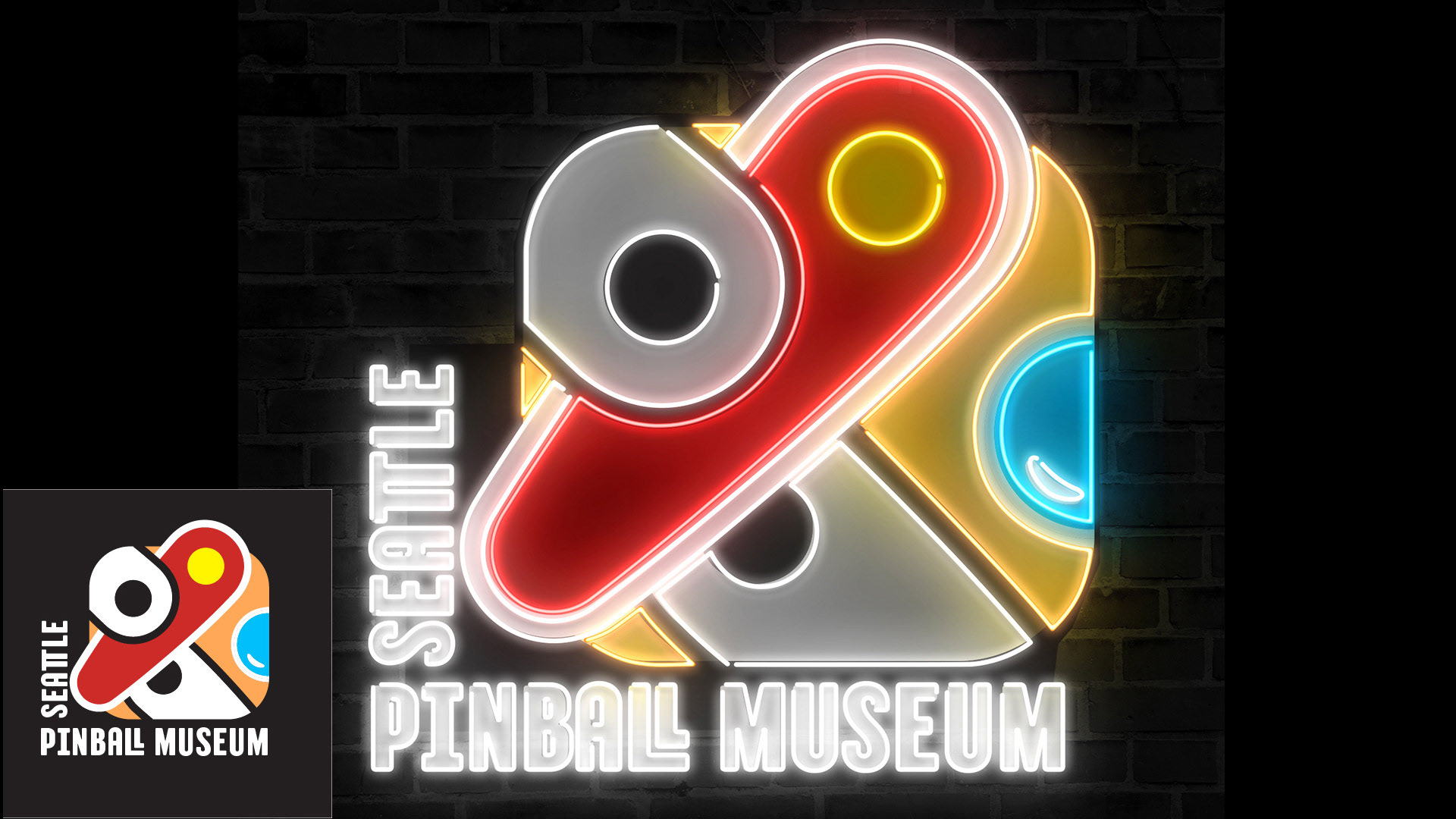
Seattle Pinball Museum logo neon sign created using Adobe Photoshop.
Project Category: Branding, Art Direction, Visual Design
Timeframe: 11 weeks
Roles: Branding, art direction, visual design
Tools: Adobe InDesign, Adobe Illustrator, Adobe Photoshop
Overview: branding for Seattle Pinball Museum
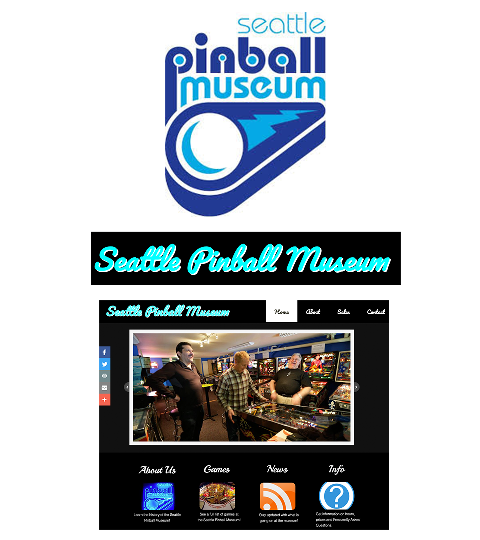
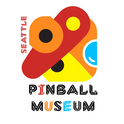
Here are some examples of the Seattle Pinball Museum's original branding
Problem to Solve: The branding of the Seattle Pinball Museum suffered from a lack of consistency and clarity. The logo failed to capture the exhilaration and liveliness of pinball, the website was obsolete, and the museum's social media accounts were disjointed. This absence of a cohesive brand identity made it challenging for prospective visitors to comprehend the museum's offerings and anticipate the kind of experience they would have when they visit.
Research & Demographic: The research consisted of a thorough review of the client's existing branding, which included a site visit and documentation, as well as an audit of their existing website. This was coupled with research into other businesses currently in the pinball arcade space (the competition), an investigation into the history of the game of pinball, as well as the demographics of the people who enjoy the game.
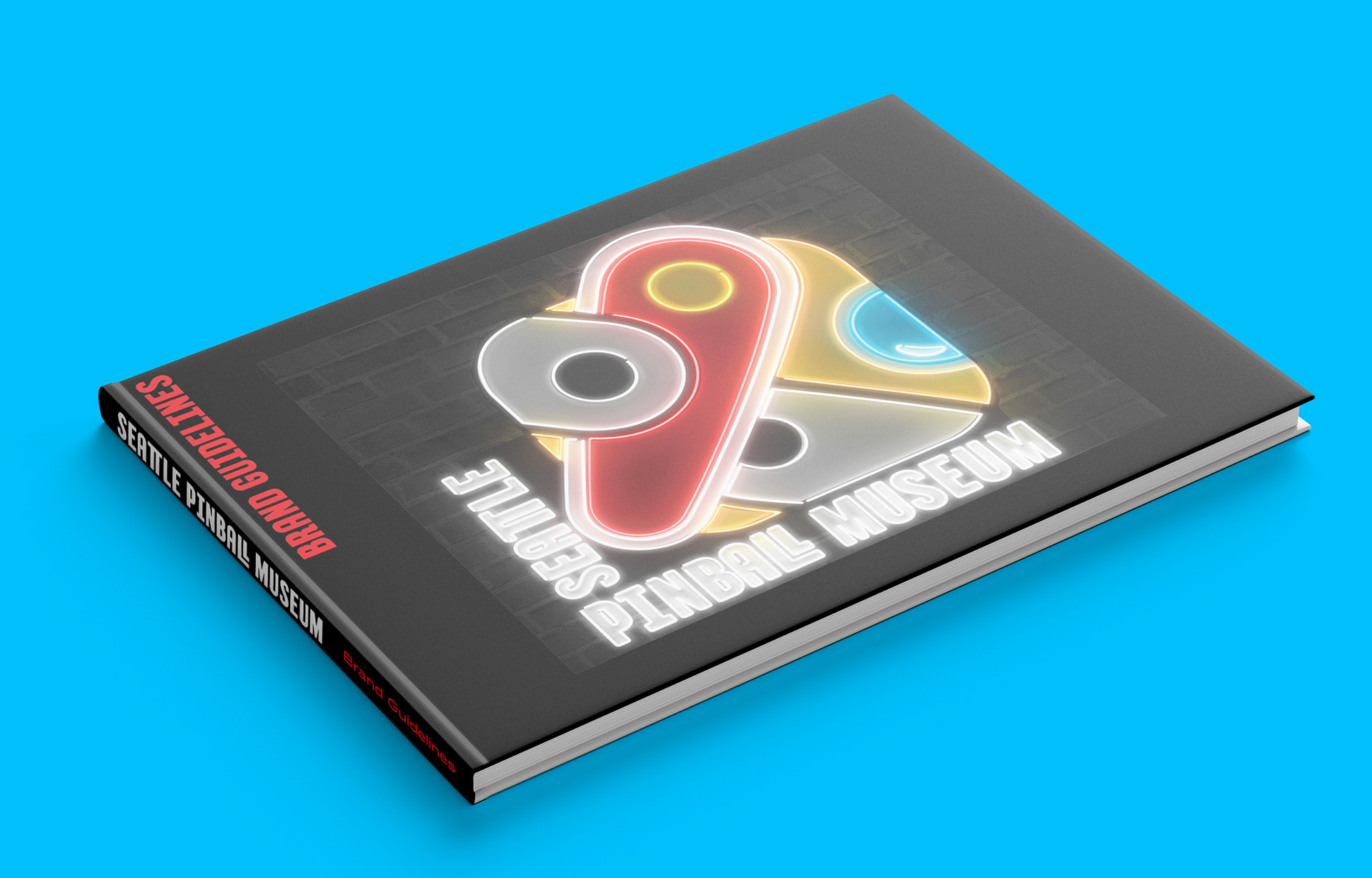
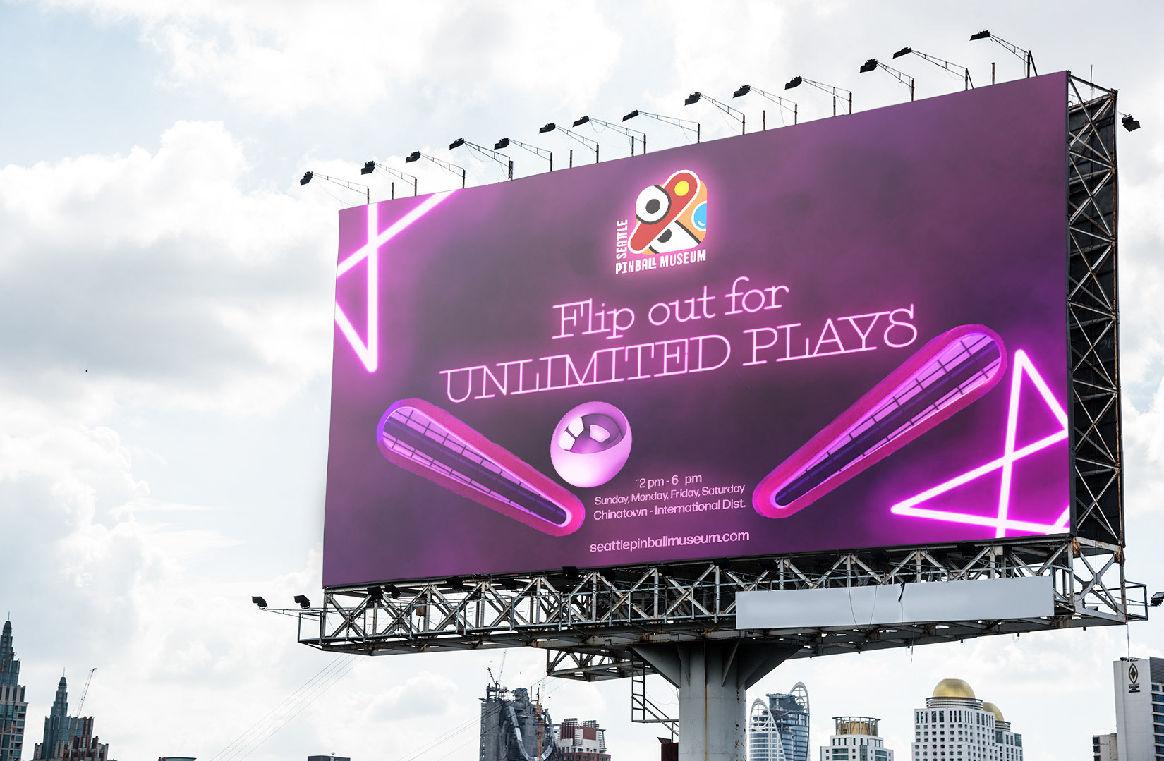
Solution or Objective & Process: A redesigned logo was created that effectively conveyed the sense of excitement and energy associated with pinball. An outdoor advertising campaign was developed to showcase the fun and vibrant experience of playing pinball at the museum, and branded merchandise was created that reflected the museum's brand identity. Clear and attractive signage was designed to guide visitors to the museum and reinforce the brand identity.

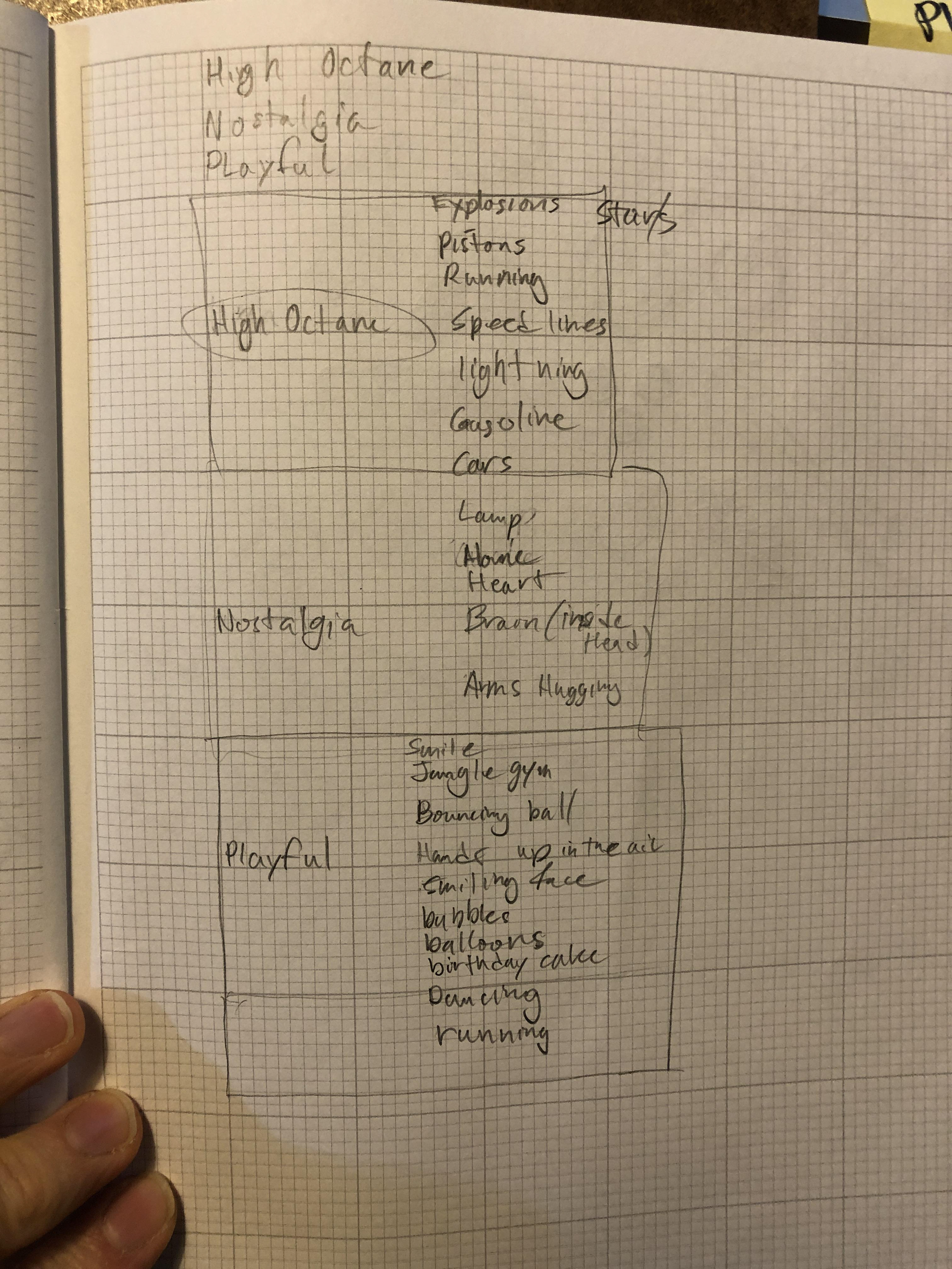
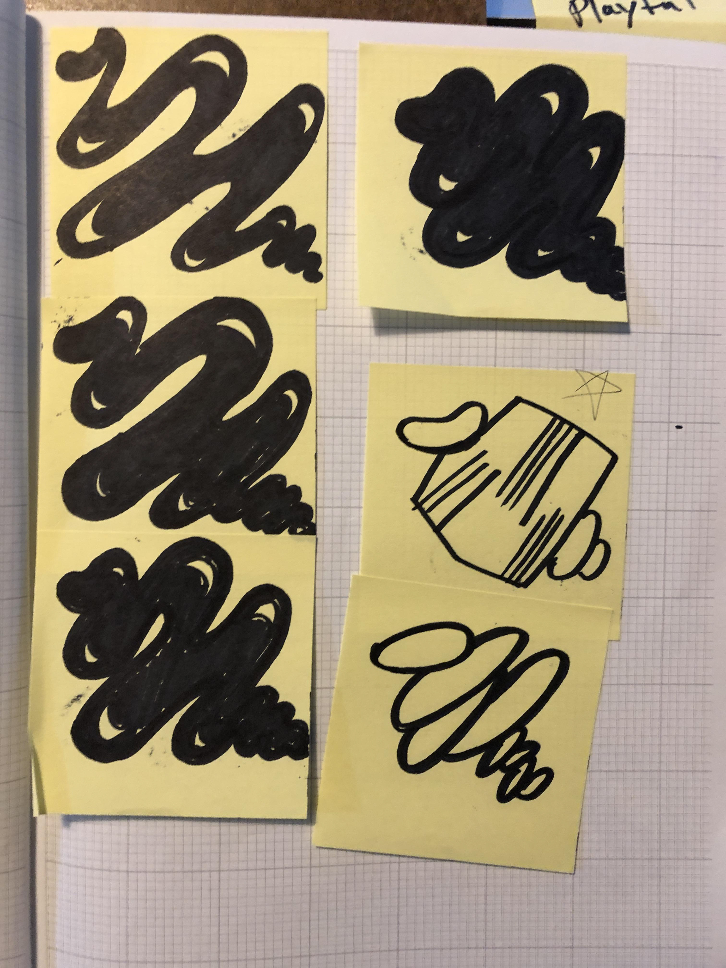
Before sketching, much brainstorming was done.
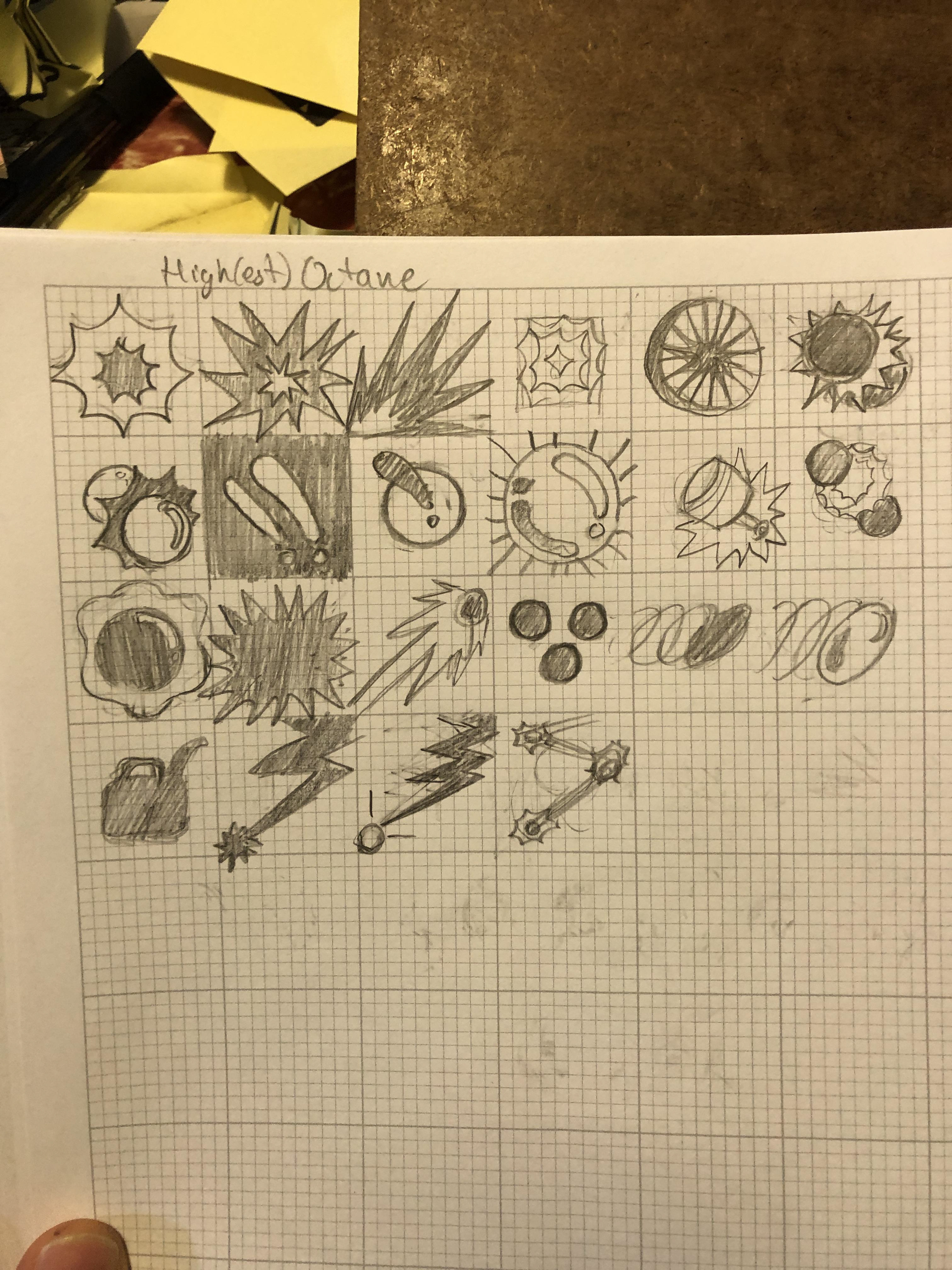
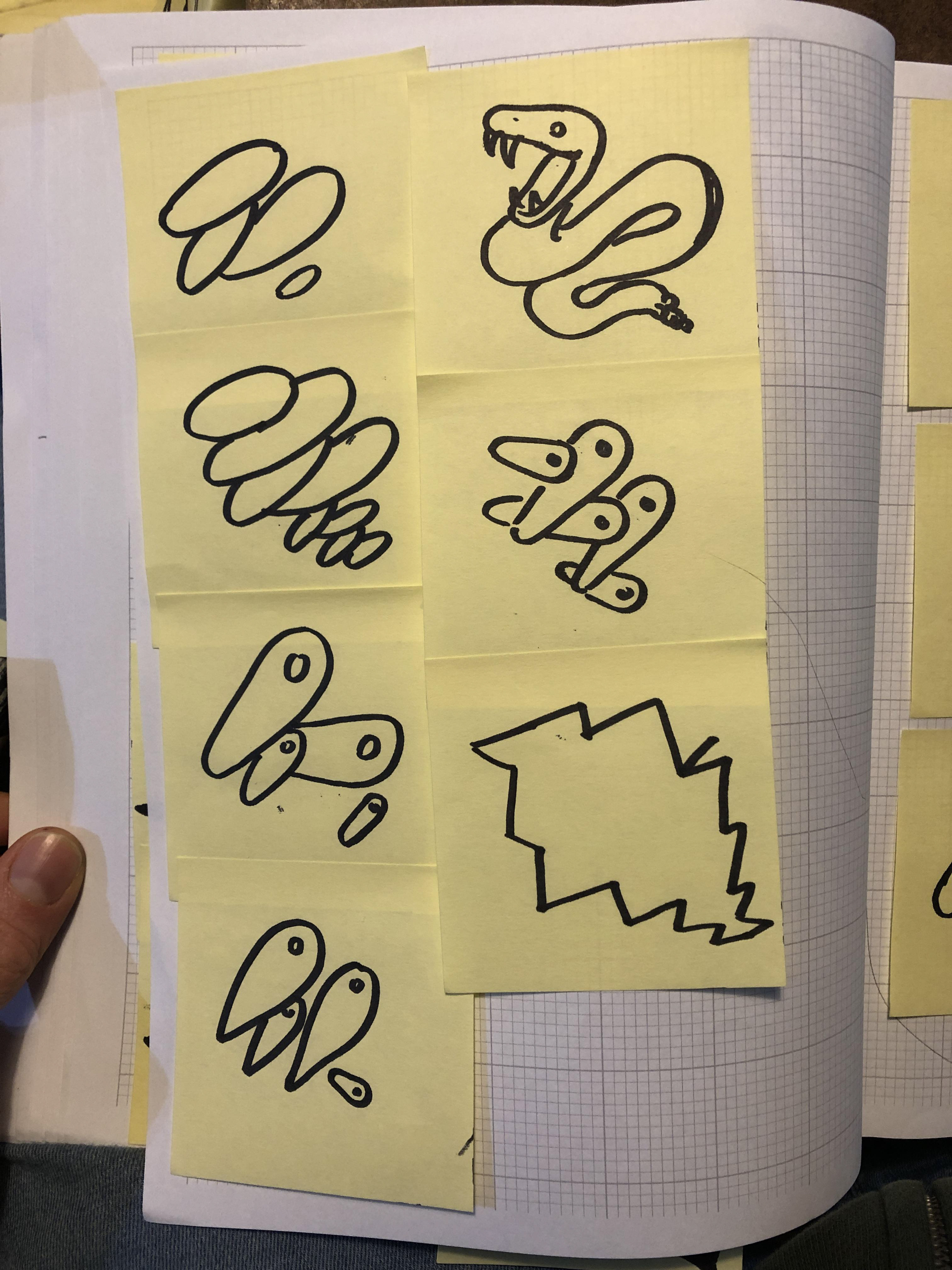
More logo skeches...
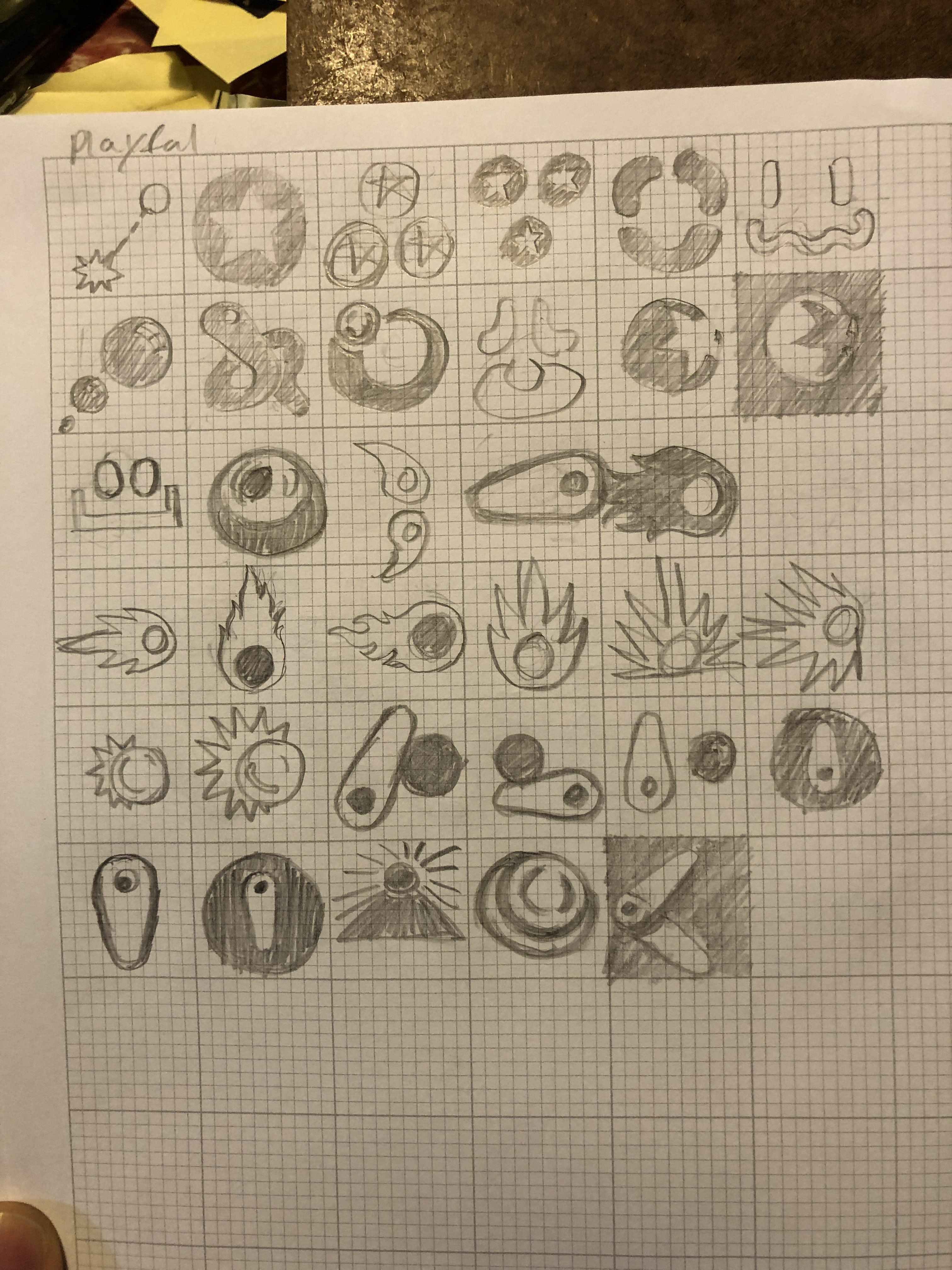
More logo skeches...
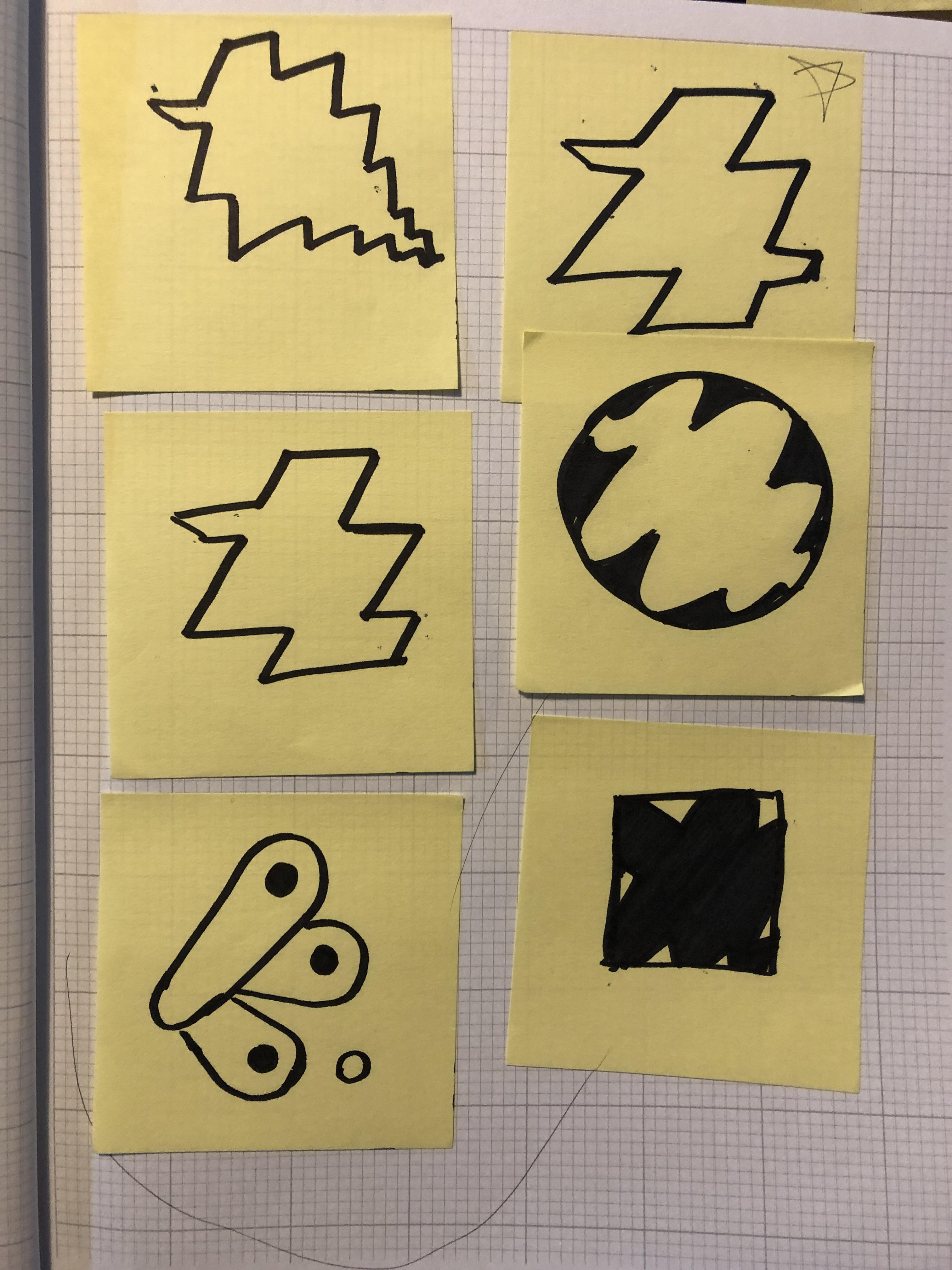
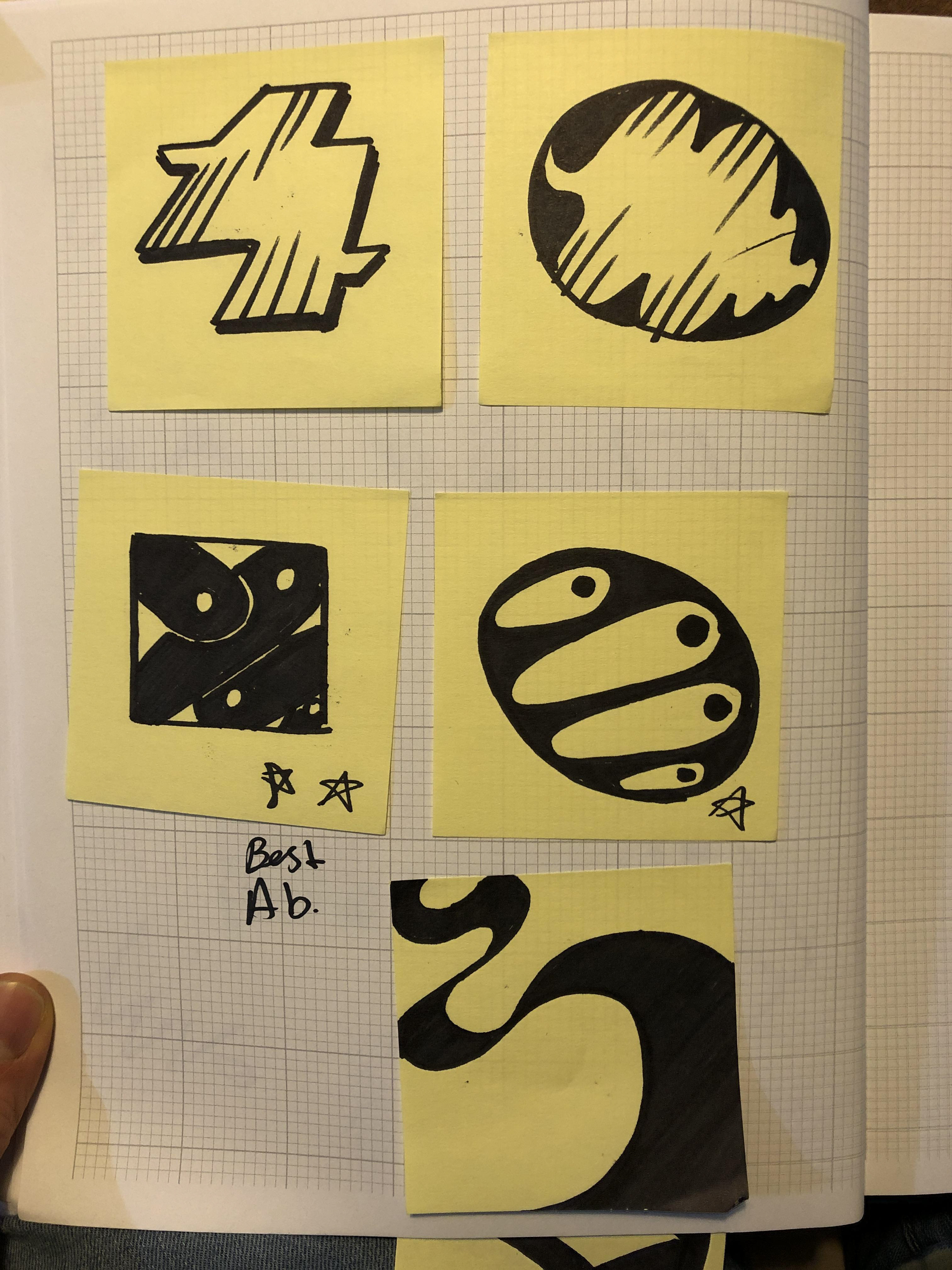
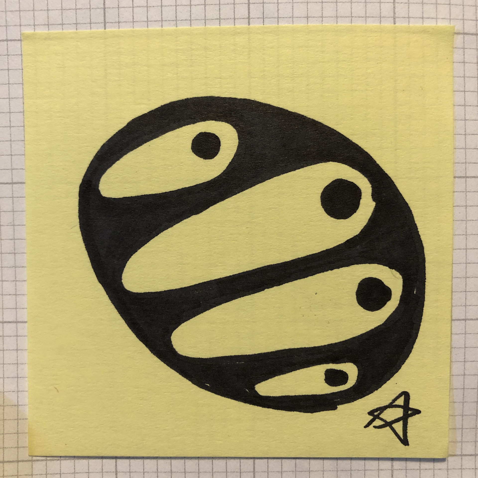
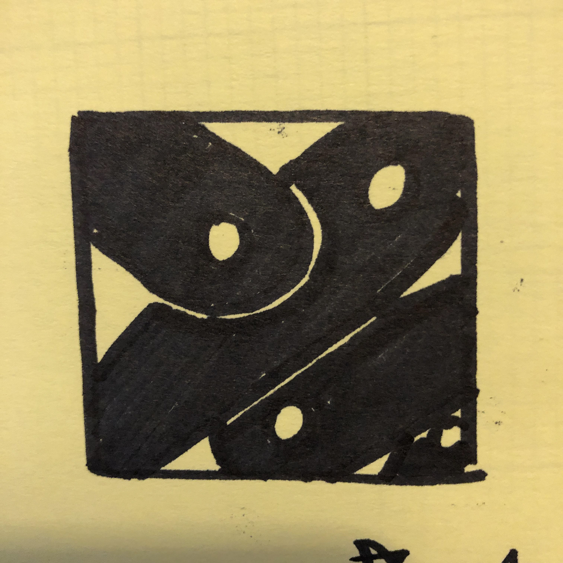
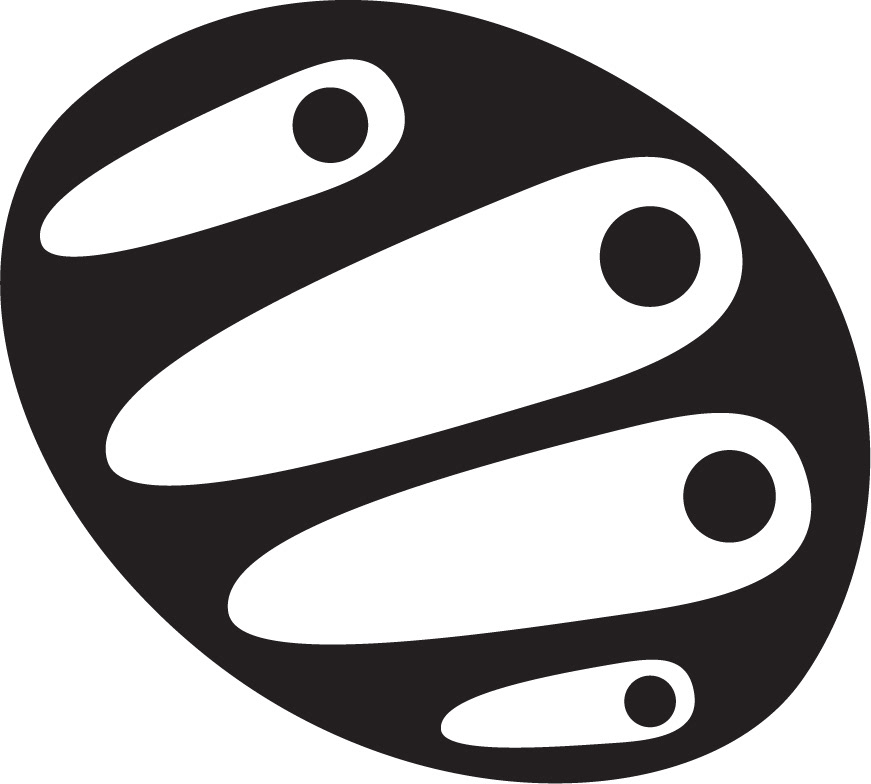
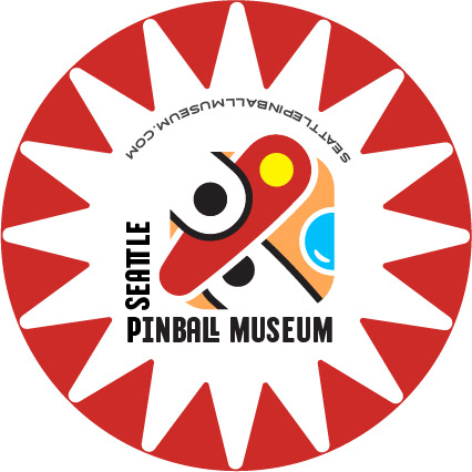
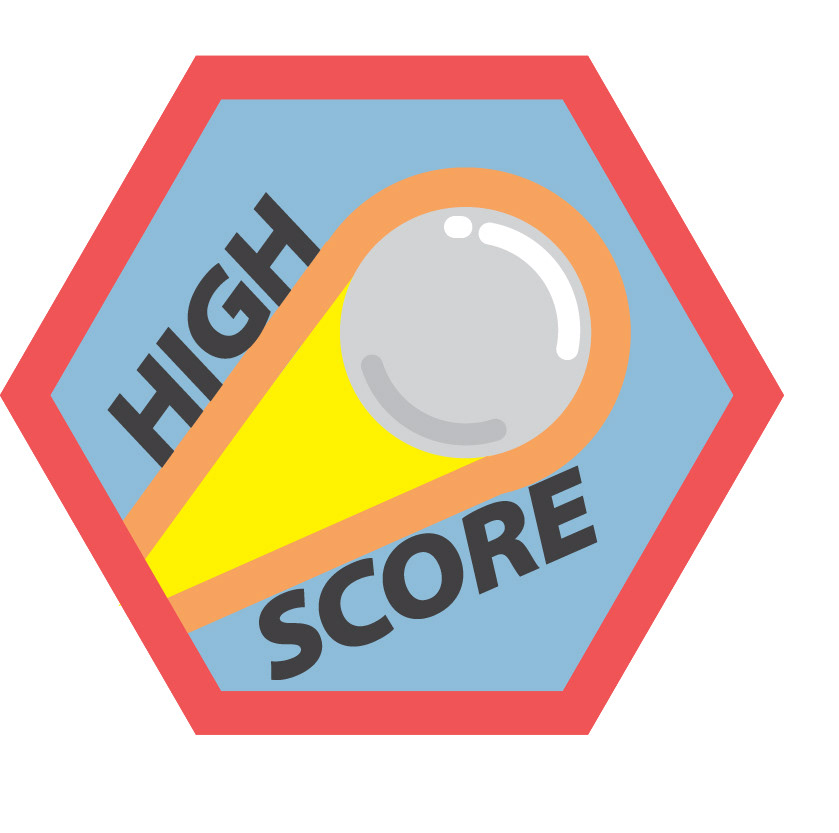
Logo Creation Process: An exhaustive process was used to create the final logo design that involved creating over seventy-five sketches. Drawing on research conducted earlier, a design referencing the pinball flipper was chosen, because it expresses pinball's dynamic nature using an aspect of the game that the audience would most likely find familiar.
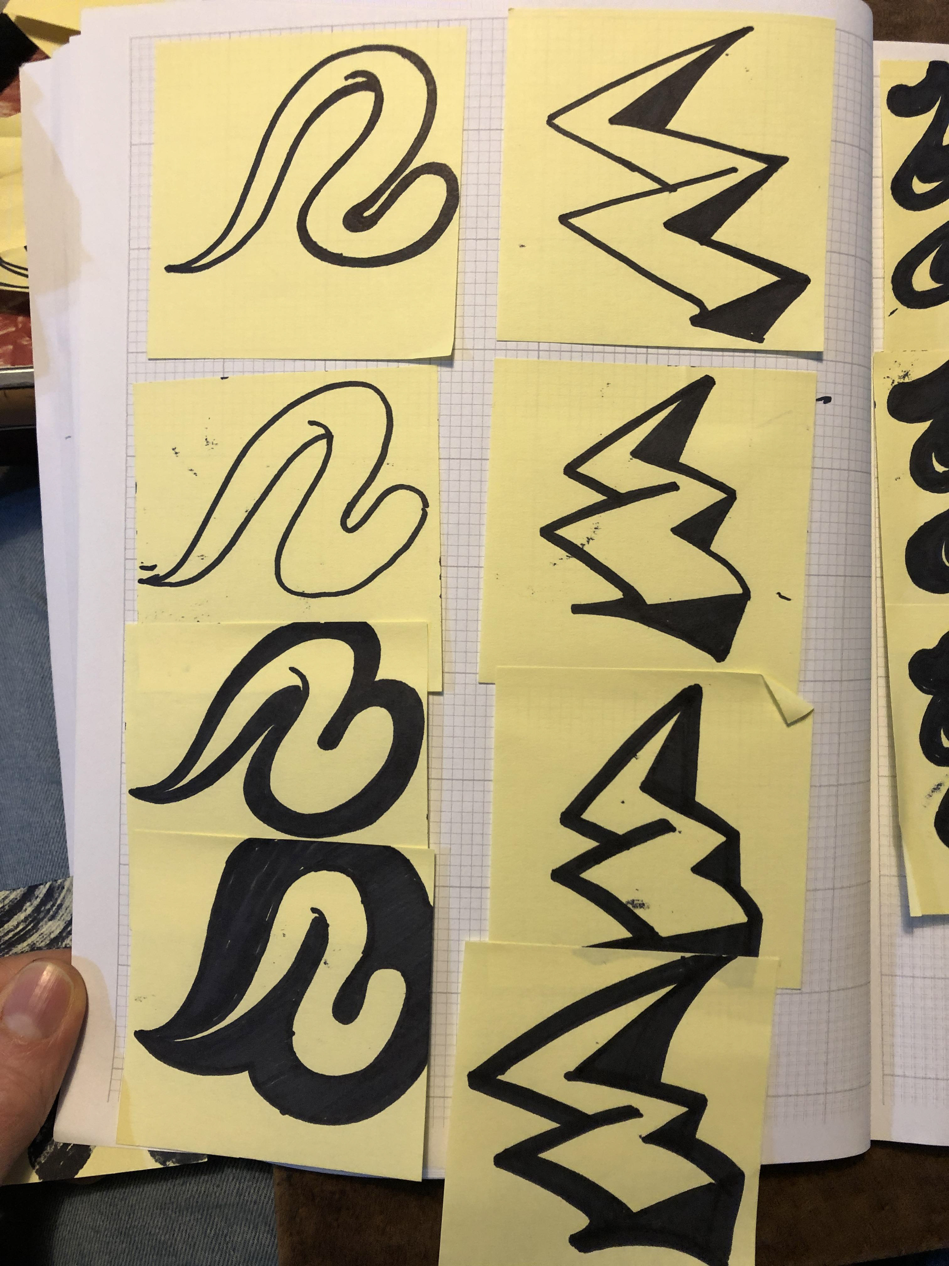
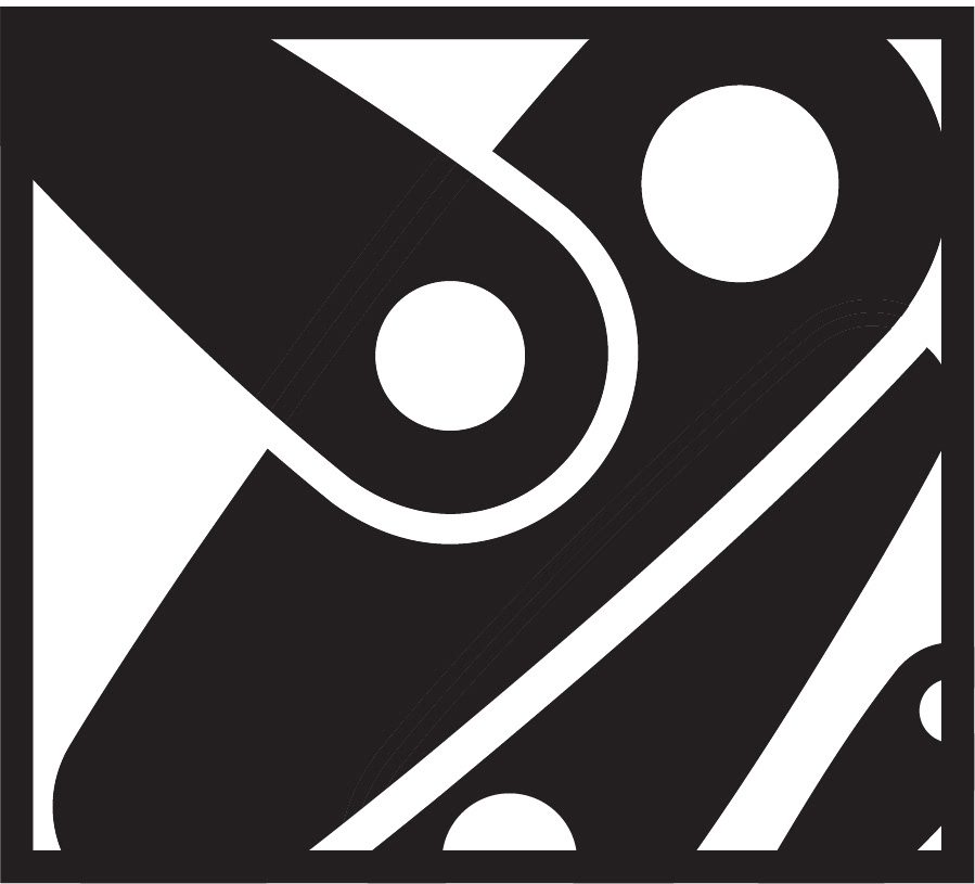
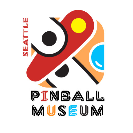
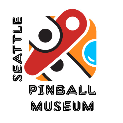
Vector sketches came next, and then color was added. Things were looking pretty good, but more work was needed to find the best typographic treatment and lockup.
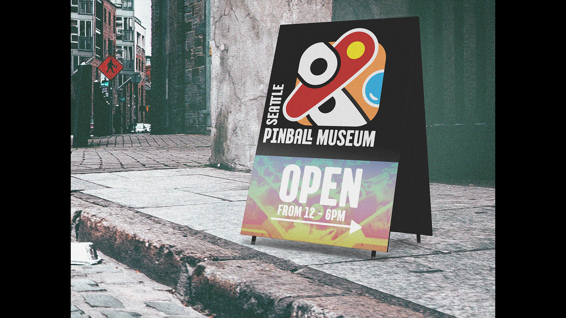
Sandwich Board
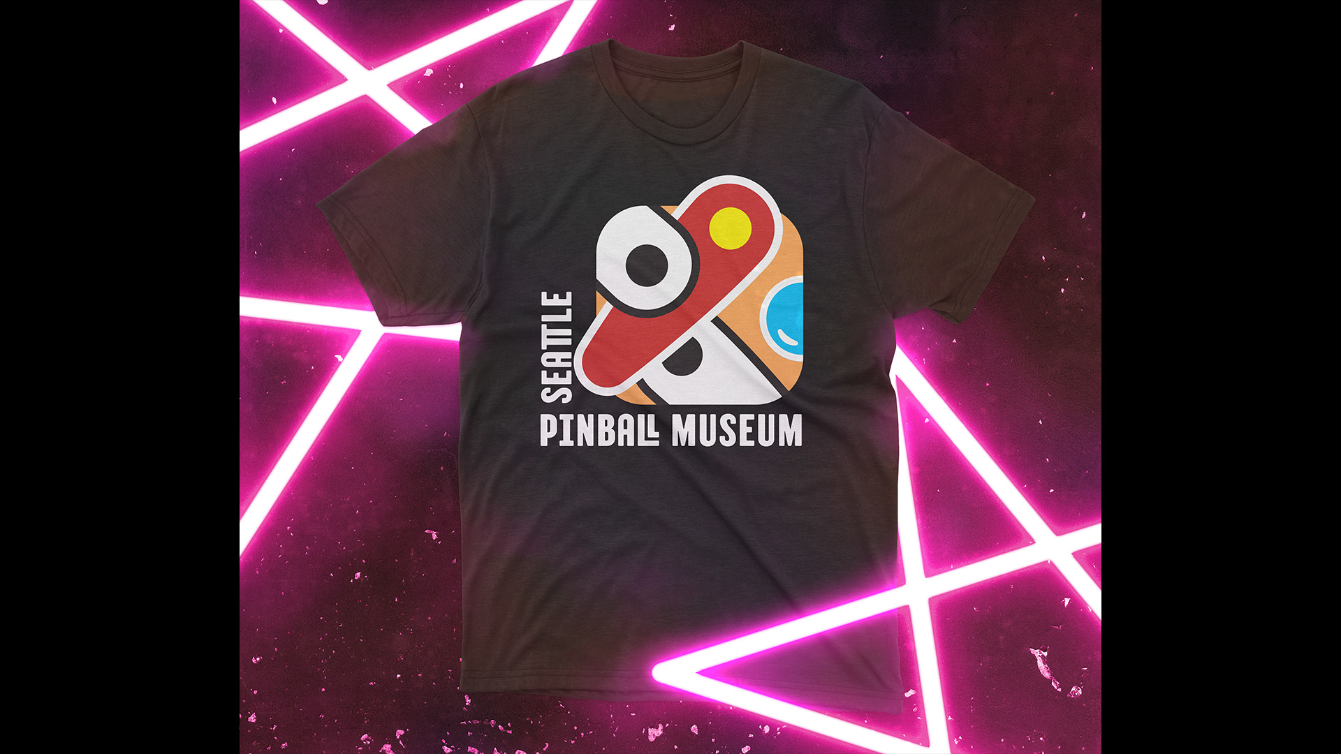
Branded Tee-shirt
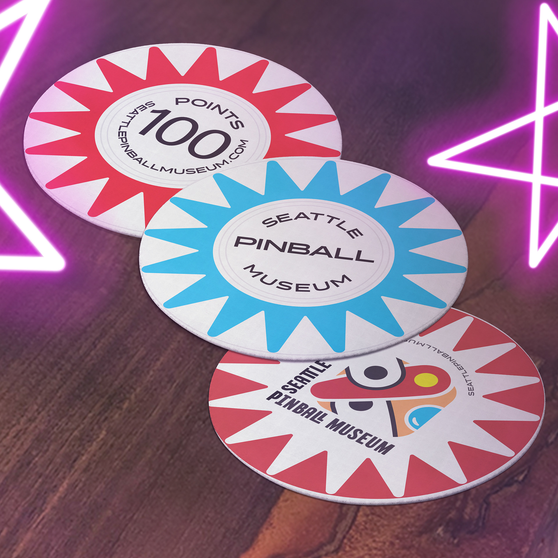
Coaster
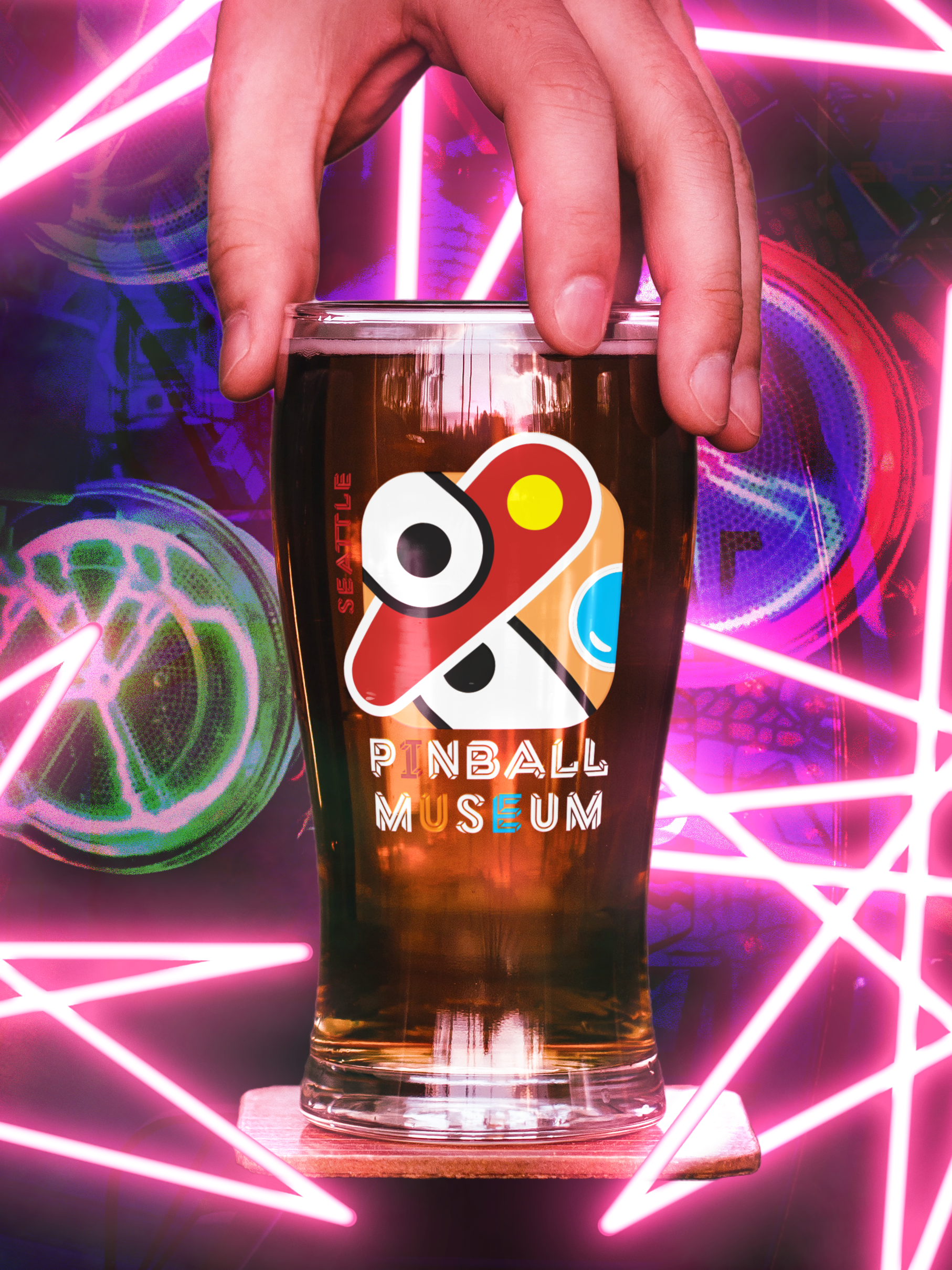
Pint Glass
Project Deliverables: Top Left - Sanwhich board, Logo Teeshirt, Coasters featuring branded bumper design, Pintglass, Branded bumper designs, and a billboard advertisement.
Bumper Graphic: Branded (red, black, white)
Bumper Graphic: Branded Logo (red, black, white)
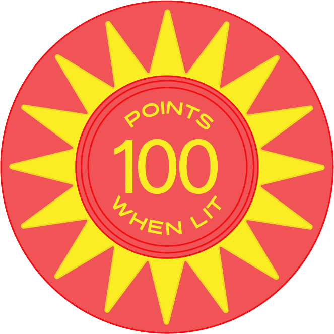
Bumper Graphic: (red, yellow)
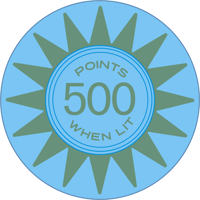
Bumper Graphic: (blue, green)
Bumper GrBumper Graphic: Branded (blue, black, white)aphic: Branded (red, black, white)
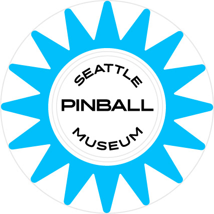
Button Graphic
Final Insights: Clear and consistent branding makes a really big difference in the user experience. When a company or organization's voice closely aligns with the product or service they provide it becomes easier for the guest to develop a positive mental and emotional association with the client. When the product the client is providing is as fun and energetic as pinball then it’s even more important. The consistent and exciting execution of this rebrand will serve to help the client make a deeper and longer-lasting connection with older clients and attract new clients through increased brand awareness generated by an outdoor ad campaign.
Next steps would include an expanded advertising campaign using the “you’ll flip for unlimited plays” tagline across multiple media streams, along with a website redesign.
Check out my other projects
Scarfff Comics Newspaper
Posters